FMX.Layouts.TGridLayout
Delphi
TGridLayout = class(TControl)
C++
class PASCALIMPLEMENTATION TGridLayout : public Fmx::Controls::TControl
Properties
| Type | Visibility | Source | Unit | Parent |
|---|---|---|---|---|
| class | public | FMX.Layouts.pas FMX.Layouts.hpp |
FMX.Layouts | FMX.Layouts |
Description
A control that arranges child controls in a grid of equally sized cells.
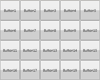
A TGridLayout grid layout is a container for graphical objects that can arrange the objects it contains in a grid, as shown in the following image:
The children of a TGridLayout are resized to fit the sizes specified through the ItemHeight and ItemWidth properties. If the orientation is set to Horizontal, the child controls of a TGridLayout are lined one by one until the width of the layout is exceeded when a new line is added to the grid. If the orientation is set to Vertical, the child controls of a TGridLayout are positioned one under another until the height of the layout is exceeded when a new column is added to the grid.
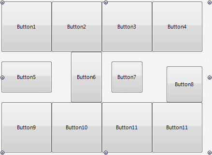
However, you can customize sizes of child controls using the Margins properties of child controls. For example, the following image demonstrates the usage of different margins for Button5, Button6, Button7, and Button8 child controls:
Here we set:
- The Top and Bottom margins for Button5.
- The Left margin for Button6.
- All four Top, Left, Right, and Bottom margins for Button7.
- The Top and Left margins for Button8.
Look how child controls are resized and positioned inside the respective grid cells.
Note: The Align property of the controls within a TGridLayout is ignored. The Position, Height, and Width properties for child controls are automatically set, and explicitly changing their values has no effect.

