Metropolis UI Application Templates
Go Up to Developing Metropolis UI Applications
Contents
This topic describes the three templates for Metropolis UI applications or forms in RAD Studio. The topic includes implementation details for the two frameworks - FireMonkey and VCL. A major difference is that FireMonkey implements new controls for Metropolis UI (such as TMetropolisUIListBoxItem), while VCL uses existing Windows controls styled for Windows 8.
Following are the templates you can choose in the Metropolis UI wizards:
Metropolis UI Templates are Windows Specific
Metropolis UI templates for Grid and Split Pane layout are designed specifically for Windows 8, although they can be deployed to Windows 7, Vista and XP as well. The templates are representative of common applications you might see on Windows 8.
We do not recommend using Metropolis UI templates on the Mac because the template designs are specific to Windows 8, and are not designed to deliver a common UI or a familiar user experience for Mac users. However, it is possible to remove the Metropolis UI style from an application and then deploy the application to Mac.
The Metropolis UI templates share similar properties that characterize the Metropolis UI look and feel, such as the following:
- Full Screen: The Metropolis UI forms are automatically set to full screen height with no non-client area, so your application is truly full-screen:
- WindowState is set to
wsMaximized. - BorderStyle is set to
None. - GlassFrame properties are not set.
- WindowState is set to
FireMonkey Template Features
- AppBar: The Grid and Split Pane template windows have a popup toolbar (Metropolis UI Style AppBar) that can be invoked by a swiping gesture from the bottom of the screen.
- The AppBar is comprised of a ToolbarHolder layout that is used to capture gesture events, and a child TPopup that contains the toolbar itself. ToolbarPopupAnimation is triggered automatically whenever the popup is shown and hidden, and the code that invokes the popup (*Form.ShowToolbar) calculates the start value of Popup position based on window dimension.
- TListBox with TMetropolisListBoxItem: Both the Grid and Split Pane templates use TListBox controls with TMetropolisUIListBoxItem, a new FireMonkey Metropolis UI control.
- In the Metropolis UI forms, FireMonkey controls use the Align and Padding properties extensively in order to occupy all available screen space.
- The FireMonkey style is part of a Metropolis UI form that includes a StyleBook containing the specific Metropolis UI style.
- StyleLookup: For FireMonkey controls, the StyleLookup property enables the plain control (such as TButton) to change into a Metropolis UI control, such as a TPasswordEditButton. For more information, see StyleLookup Support for Metropolis UI Controls (FireMonkey) and Applying FireMonkey Styles.
VCL Template Features
- AppBar: The touch-enabled AppBar is implemented as a TLabel located along the lower edge of the form, just above the horizontal scroll bar. When you swipe or flick up from the lower edge, the AppBar displays; the template contains a Windows 8 style Close button.
- Horizontal scroll bar: At the bottom of the form is a TScrollBox with the HorzScrollBar property set to TControlScrollBar.
- Virtual Keyboard: The
.dprfile includes code to automatically display the onscreen keyboard for components that need user input when no physical keyboard is connected:
Delphi:
Application.UseMetropolisUI;
C++:
Application->UseMetropolisUI();
Blank Metropolis UI Template
The Blank Metropolis UI templates have no predefined layout and so can be treated as a blank canvas. At run time, you swipe or flick the displayed form (with touch or mouse) to move to the other form.
- There are no components placed on the form (other than an appbar).
- The default style for the application is MetroDark.
- For the VCL blank template, the horizontal scrollbar (encompassing the form itself) is set to
Visible=True.
- Note: When you run a blank full-screen Metropolis UI application from the IDE, you can close the application by pressing
ALT+F4.
Grid Metropolis UI Template
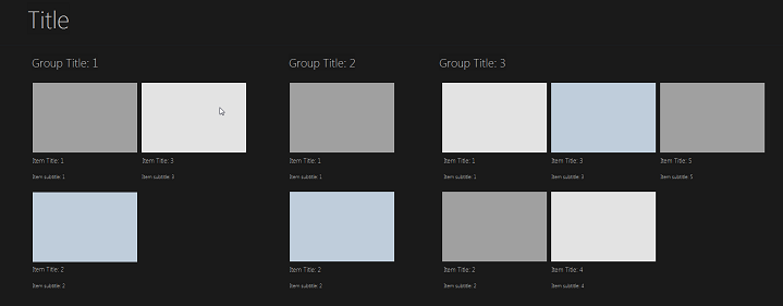
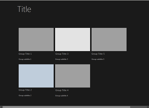
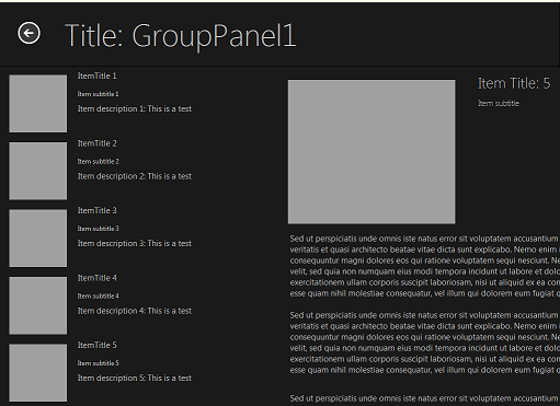
The Grid application contains several groups of items, each of which opens a DetailView page.
FireMonkey Grid Template
|
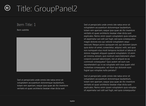
DetailView: |
GridView: |
|
Notable components of the FireMonkey Grid template are:
Scrolling can be done with a scrollbar, with MouseTracking = True it can be done by pulling the contents with LMB
- Enabled for touch and gestures; using GestureManager, all the standard gestures can be used as well.
- TLayout used for header, main frame, and footer
- Horizontal scrollbox (THorzScrollBox), which functions like a TVertScrollBox that is oriented horizontally, contains all the controls and is used for paging through the application at run time. The dimensions of THorzScrollBox are calculated as a union rectangle of all the controls it contains.
- TMetropolisUIListBoxItem, which contains a Title and a Subtitle (descriptive text).
- Metro style buttons (Save, Apply, Close)
VCL Grid Template
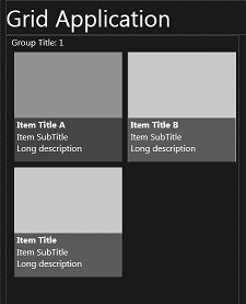
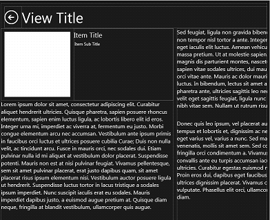
These are the VCL run-time forms for the Metropolis UI Grid template (VCL styles are not employed at design time):
The VCL Grid Metropolis UI template is a Windows VCL application that has two forms:
- groupedItems
- The main form, groupedItems.pas, displays groups of items with images and a title and subtitle. The groupedItems form layout is implemented using TFlowPanel and is scrollable (left and right). Clicking the image displays the ItemDetail form.
- ItemDetail
- Displays the image, title and a detail area containing text. The entire detail area is scrollable (left and right). The detail area is implemented using read-only TMemo components.
The main features of the VCL Grid Metropolis UI template are:
- The default style for the application is MetropolisUIDark (note that the style is only used at run time for VCL).
- Clicking any image in groupedItems displays the itemDetail form.
- The detail area in the itemDetail form is scrollable (left and right).
- Swiping up from the lower edge of the form displays an AppBar. (For more information about AppBars, see Creating a Metropolis UI Application Bar.)
Split Pane Metropolis UI Template
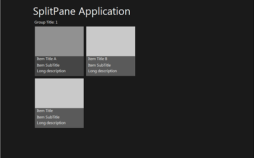
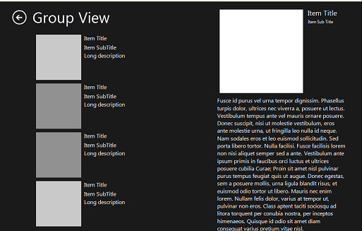
The Split Pane application contains the same GridView as the Grid application, but with fewer items. Each item opens a SplitPaneView, which contains a list of items on the left and the DetailView on the right.
FireMonkey Split Pane Template
|
GridPaneView: |
SplitPaneView: |
Notable components of the FireMonkey Split Pane template are:
- A header that contains the title and optional buttons: a TLayout with a TLabel
- TImageControl for graphics
- TLayout with TLabels for information display
- TLabels for display
- Footer with buttons:
- TToolBar with buttons
- TLayout with Metro style buttons
VCL Split Pane Template
These are the VCL run-time forms for the Split Pane template (VCL styles are not employed at design time):
GroupedItems Pane:
ItemDetail Pane:
The VCL Split Pane Metro template is a Windows VCL Application that has two forms:
- groupedItems
- The main form is groupedItems.pas. This form displays item groups, images, and a title and subtitle for the group. The items area is scrollable (left and right). Clicking the image displays the splitItemDetail form.
- splitItemDetail.
- Displays a split view using two TScrollBox elements.
- The TScrollBox on the left simulates the appearance of a list view with images and text. This is done using TGridPanel. Clicking an image, title, subtitle, or description on the left refreshes the title and subtitle labels in the detail area on the right.
- The detail area on the right is a TScrollBox containing a TImage and read-only TMemo components to display information. The detail area on the right is scrollable (up and down).
The main features of the VCL Split Pane Metropolis UI template are:
- The default style for the application is MetropolisUIDark.
- The groupedItems form layout is implemented using TFlowPanel and is scrollable (left and right).
- Clicking any image in groupedItems displays the splitItemDetail form, and the title at run time is derived from the originating item on the groupedItems pane.
- The list view on the left in splitItemDetail is implemented using TGridPane components.
- The detail area on the right in the splitItemDetail form is scrollable (up and down).
See Also
- Metropolis UI application wizards:
- Metropolis UI Fonts
- Applying FireMonkey Styles
