StyleLookup Support for Metropolis UI Controls (FireMonkey)
Go Up to Developing Metropolis UI Applications
The Metropolis UI styles supported by FireMonkey include basic styles for controls (such as cancelbutton for a TButton), as well as specific styles for Metropolis UI applications (such as Metropolis UI Dark). This topic describes how to use a control's StyleLookup property to select the style of the control from available preset designs.
Contents
To change the style of a control to a specific Metropolis UI style
- From the Tool Palette, add a FireMonkey control that supports Metropolis UI styles, such as TButton, TLabel, or TPanel.
- In the Object Inspector, select the control and click the down-arrow in the StyleLookUp property.
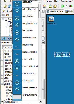
- Choose any value from the dropdown list associated with the StyleLookup property in the Object Inspector. The list includes a preview image for each item. The specific style for a control can define a fixed size, font and behavior for the control.
For example, the following screenshot shows only a portion of the many StyleLookup choices (styled buttons with icons) that are available for a Metropolis UI style TButton:
StyleLookup Choices for Metropolis UI FireMonkey Styles
The following table summarizes the various Metropolis UI StyleLookup choices available for specific FireMonkey controls:
| FireMonkey Control and Description of StyleLookup Choices | Associated StyleLookup Values |
|---|---|
|
TButton and TSpeedButton A collection of buttons with Metropolis UI style icons for toolbars. These buttons have a fixed size. Some buttons have two versions -- one version with no text or label, and another version with text or a label, as indicated in their names. |
addbutton, addbuttontext, applybutton, applybuttontext, backbutton, backbuttontext, buttonstyle, buttonstylelabel, cancelbutton, cancelbuttontext, cleareditbutton, closebutton, closebuttontext, colorbuttonstyle, commandbutton, commandbuttonlabel, contactsbutton, contactsbuttontext, cornerbuttonstyle, documentbutton, documentbuttontext,dropdowneditbutton, editbutton, editbuttontext, ellipseseditbutton, flipviewbottombutton, flipviewleftbutton, flipviewrightbutton, flipviewtopbutton, flyoutbutton, flyoutbuttonlabel, forwardbutton, gearbutton, gearbuttontext, helpbutton, helpbuttontext, homebutton, homebuttontext, listitembutton, listitembuttonlabel, mutebutton, mutebuttontext, nextbutton, nextbuttontext, numberbutton, numberbuttonlabel, passwordeditbutton, pausebutton, pausebuttontext, photobutton, photobuttontext, playbutton, playbuttontext, priorbutton, priorbuttontext, pushbutton, radiobuttonstyle, refreshbutton, refreshbuttontext, removebutton, removebuttontext, retrybutton, retrybuttontext, roundbutton, roundbuttonlabel, savebutton, savebuttontext, searchbutton, searchbuttontext, searcheditbutton, speedbuttonstyle, speedbuttonstylelabel, spineditbutton, spinrightbutton, tilebutton, tilebuttondescriptionlabel, tilebuttonfixed, tilebuttonlabel, tilebutton, tilebuttondescriptionlabel, tilebuttonfixed, tilebuttonfixedlabel, tilebuttonlabel, tilebuttonnamelabel, tilebuttontitlelabel, toolsbutton, transaprentcirclebuttonstyle, trashbutton, trashbuttontext, videobutton, videobuttontext, volumebutton, volumebuttontext |
|
A collection of Metropolis UI style labels. Some labels have two versions -- one version with no text or label, and another version with text or a label, as indicated in their names. |
buttonstylelabel, calendarlabelstyle, commandbuttonlabel, flipviewtitlelabel, flyoutbuttonlabel, flyoutlabel, flyouttitlelabel, griditemsubtitlelabel, griditemtitlelabel, gridpanelitemsubtitlelabel, gridpanelitemtitlelabel, gridpaneltitlelabel, gridsubtitlelabel, gridtitlelabel, labelstyle, listitembuttonlabel, numberbuttonlabel, pageheaderlabel, pagesubheaderlabel, roundbuttonlabel, speedbuttonstylelabel, tilebuttondescriptionlabel, titlebuttonfixedlabel, tilebuttonlabel, tilebuttonnamelabel, tilebuttontitlelabel, toolbarlabel, tooltiplabel |
|
calloutpanelstyle, checkedpanel, flipviewpanel, flyoutpanel, gridpanel, gridpanelitemsubtitlelabel, gridpanelitemtitlelabel, gridpaneltitlepanel, grouppanel, panelstyle, tooltippanel |
Examples
- The commandbuttonlabel value of the StyleLookup property for TLabel can change states. To implement:
- Move a TLabel control inside a TButton control.
- Set the following properties:
- TLabel.StyleLookup="commandbuttonlabel"
- TLabel.HitTest = False
- TLabel.Locked = True
- As a result, you can have a button with an unlimited number of text objects (TLabel controls).
- Use these same steps for label styles such as "tilebutton" and "tilebuttonfixed" too (TButton).
- Flip Buttons: A "flipview" is a scrollable Windows 8 control that lets you flip through a collection of items, one at a time. Scroll buttons for a "flipview" style TButton control include the following:
|
flipviewleftbutton: |
flipviewrightbutton: |
||
|
flipviewtopbutton: |
flipviewbottombutton: |
- These flip buttons, typically placed at the edge of the form, provide the flip mechanism for a flipview at run time. The buttons should bring the next item into view. (If necessary, clear the Name field so that the button has only the glyph without text.)
- Tile Buttons: These special buttons look like Windows 8 tiles and have fixed sizes: tilebutton, tilebuttondescriptionlabel, tilebuttonfixed, tilebuttonlabel, tilebuttonnamelabel
See Also
- Creating Metropolis UI Edit Buttons with Embedded Glyphs
- Creating a Metropolis UI Application Bar
- Applying FireMonkey Styles
- FireMonkey Style Designer
- Creating a FireMonkey Component (Delphi)
- Creating a FireMonkey Component (C++)
- Creating a Styled FireMonkey Component by Extending an Existing Component
- Creating a Component Editor and a Property Editor for FireMonkey Components
- Mobile Tutorial: Using a Button Component with Different Styles (iOS and Android)


