Bitmap Style Designer
Go Up to Graphic Utilities Index
Contents
Tools > Bitmap Style Designer
The Bitmap Style Designer enables you to:
- Create, edit, and test FireMonkey styles (
.stylefiles)
- Create, edit, and test VCL styles (
.vsffiles) - Convert a VCL style (
.vsffile) into a FireMonkey style by saving the VCL style as a FireMonkey style (.stylefile)
.style file), you need to use the FireMonkey Style Designer.In the Bitmap Style Designer, you work only with a style-template -- that is, an objects tree with parameters. A style template has a constant format independent of framework. The style converter that is integrated with the designer generates a real style from this template.
For more information about what a style represents, see:
Bitmap Style Designer Window
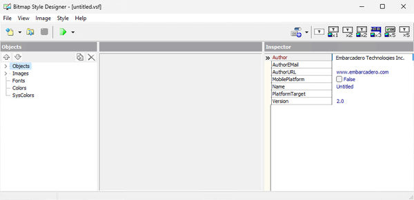
The Bitmap Style Designer contains two or three panels, depending on the object node that is currently open:
- The left-hand panel always displays the Objects Tree.
- When you open the Objects node, the Designer contains two other panels:
- The Object/Style Viewer in the center panel.
- The Inspector, in the right-hand panel.
- When you open any of the other nodes (Images, Fonts, Colors, or SysColors), only the Viewer appears, and it occupies the area of the center panel and the right-hand panel.
Objects Tree
The Objects tree, in the left-hand panel of the designer, contains the elements that can be customized in a style.
The following table describes the nodes in the Objects Tree.
Node Description 
(Up/Down Arrows)Buttons that move a selected object up or down in the current subtree.

(Duplicate object /
Delete object)Buttons that:
- Add a duplicate of the selected top-level object in the tree of the object. The copy is placed at the end of the tree and is given a new name (<name>_copy).
- Delete an object from the tree the object.
- You cannot delete or rename objects created by Embarcadero, but you can add and delete your own new objects.
Objects
A tree structure showing the user interface controls that can be styled, such as Button, Edit, Form, and so on.
Images
The image files used to select the look of controls. An image contains pictures of the parts and states of controls. You can create such images using graphic editing software.
Fonts
A list of fonts used for the text of controls. The text is typically different for different parts and states of the control. For example, RadioButtonTextPressed defines the appearance of the text when the radio button is pressed.
Colors
A list of base colors that are used in the current style. There are two categories of colors:
- The first category includes colors used for control parts that are rendered directly from an image. In this case, the color item offers you a way to access the color of that image. For instance, the Window item specifies the color of the form background. Note that changing this color does not affect the way the control part is rendered, but is only a way to programmatically access that color.
- The second category includes the colors used for controls that are rendered from code at run time (Panel, ListBox, Grid, and so on).
SysColors
A list of system colors to help you make an application style enabled if it uses system color constants.
Style Viewer
The Viewer in the central panel contains a representation of the node or subnode selected in the Objects Tree.
- If you select an object in the tree, the viewer displays the bitmaps used for the parts and states.
- If you select Fonts, Colors, or SysColors, the corresponding lists are displayed and illustrated.
- If you select an image, you can see the image file and the image toolbar.
- The title of the Viewer contains the name of the entity or node being viewed:
- Object Viewer is the title when you select an object in the Objects Tree.
- The name of the file is displayed when you are viewing Images (the default file name is style.png).
- Fonts, Colors, and System Colors are the titles used when the Fonts, Colors, and SysColors nodes, respectively, are selected in the Objects Tree.
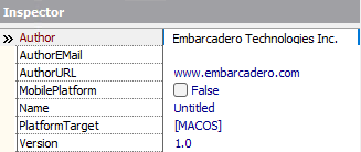
Inspector Panel
The Inspector is the right-hand panel, which displays the properties of the selected object. The Inspector is visible only when a subnode is selected in the Objects tree. By default, you have the following options when selecting Objects:
This view changes according to the selected object from the Object node. You can set or adjust properties in the Inspector similar to the way you do this in the Object Inspector in the IDE. Remember that each object has its own properties, hence only some properties can be configured.
Bitmap Style Designer Menus
The Bitmap Style Designer has a menu bar that contains the following menus.
File Menu
| Item | Description |
|---|---|
|
New |
Creates a new style. By default, the new style has the same settings as:
|
|
Open |
Opens the |
|
Save |
Saves the changes to the current style. |
|
Save As |
Saves the current style in a specific location or with a different name. |
|
Exit |
Closes the Bitmap Style Designer. |
View Menu
| Item | Description |
|---|---|
|
Object Inspector |
Gives focus to the Inspector panel, located in the right-hand panel when the object is viewed. |
|
Object Tree |
Gives focus to the Objects Viewer panel, located in the center panel when objects are being viewed. |
Image Menu
| Item | Description |
|---|---|
|
Add |
Displays the Selected Image dialog, enabling you to choose an image to add to the list of bitmaps. |
|
Update |
Replaces the selected image with the one selected in the Selected Image dialog. |
|
Delete |
Removes an image from the Images list. |
|
Export |
Exports all the images in the list to the destination folder. |
Style Menu
| Item | Description |
|---|---|
|
Test |
Opens a sample dialog with different controls styled according to the current style. |
|
Assign colors |
Automatically assigns appropriate colors to the Colors and SysColors items based on the images used by the style. |
|
Assign Font Name |
Automatically sets the font name and font style for all objects in the current style. |
|
Assign Font Size |
Automatically sets the font size for all objects in the current style. |
|
Add New Objects for 1.5x Resolution Graphic |
Adds objects for one specific resolution (1.5x, 2.0x, or 3.0x) in the current style. The Bitmap and Margin properties are automatically adjusted for the resolution you set. |
|
Delete New Objects for 1.5x Resolution Graphic |
Deletes objects for one specific resolution (1.5x, 2.0x, or 3.0x) in the current style. The Bitmap and Margin properties are automatically adjusted for the resolution you set. |
Bitmap Style Designer Toolbar
The toolbar on the Bitmap Style Designer provides quick access to frequently used style operations. More detailed information is given in this topic about the New Style, Test Style, and Objects with Text Info. Open Style and Save Style have standard meanings that are not described here.
New Style Command
The New Style button  makes the following options available when you click the down-arrow (as the image shows, the list of new styles can also be invoked from the File > New command in the designer):
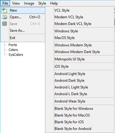
Style Commands:
| Item | Description |
|---|---|
|
VCL Style |
Creates a new VCL style (.vsf file) with the look and feel of a classic Windows application. This template includes additional elements, such as tool buttons with icons, segmented buttons, and others.
|
|
Modern VCL Style |
Creates a new VCL style ( |
|
Modern Dark VCL Style |
Creates a new VCL style ( |
|
Windows Style |
Creates a new style with the look and feel of a classic Windows application. This template includes additional elements, such as tool buttons with icons, segmented buttons, and others. You can save the style as either a FireMonkey style ( |
|
MacOS Style |
Creates a new FireMonkey style ( |
|
Windows Modern Style |
Creates a new FireMonkey style ( |
|
Windows Modern Dark Style |
Creates a new FireMonkey style ( |
|
Metropolis UI style |
Creates a new style with the look and feel of a Windows 8 application. This option includes an extended collection of controls specific to Metropolis UI applications such as: play button, document button, video button and so on, all of which you can customize. For more information, see Developing Metropolis UI Applications. |
|
iOS Style |
Creates a new FireMonkey style customized for iOS. The template includes a 3x resolution graphic (for iPhone 6 Plus device) and objects. The template works for iOS 8 and iOS 9. For more information, see iOS Mobile Application Development. For information about creating a new style customized for Retina (high-resolution) displays and the iOS target platform, see: |
|
Android Light style |
Creates a new Light style customized for the Android 4 (KitKat) target platform. The Android Light style is delivered in the product at |
|
Android Dark style |
Creates a new Dark style customized for the Android 4 (KitKat) target platform. The Android Dark style is delivered in the product at |
|
Android L Light style |
Creates a new Light style customized for the Android 5 (Lollipop) target platform. The Android L Light style is delivered in the product at |
|
Android L Dark style |
Creates a new Dark style customized for the Android 5 (Lollipop) target platform. The Android L Dark style is delivered in the product at |
|
Blank Style for Windows |
Creates an empty style for the Windows platform. You can add custom graphics and objects to the blank style, and save it as a FireMonkey style. After this, you can use the style in TStyleBook. |
|
Blank Style for Mac |
Creates an empty style for the macOS Yosemite platform. You can add custom graphics and objects to the blank style, and save it as a FireMonkey style. After this, you can use the style in TStyleBook. |
|
Blank Style for iOS |
Creates an empty style for the iOS platform. You can add custom graphics and objects to the blank style, and save it as a FireMonkey style. After this, you can use the style in TStyleBook. |
|
Blank Style for Android |
Creates an empty style for the Android platform. You can add custom graphics and objects to the blank style, and save it as a FireMonkey style. After this, you can use the style in TStyleBook. |
Open Style Command
Click the Open Style button (or select File > Open (Ctrl+O)) in the Bitmap Style Designer, and then navigate to the location of a style you want to edit. You can open only a .vsf style using the Bitmap Style Designer. (You can, however, create .style files.)
Save Style Command
Click the Save Style button (or select File > Save or File > Save As (Ctrl+S)) in the Bitmap Style Designer. You can save styles as either .vsf or .style files.
Test Style Command
Clicking the green Test Style button  opens the Style Viewer, which allows you to examine the UI elements in the style you are testing, including the styles used for enabled and disabled UI elements.
The Style Viewer displays the appropriate type of style, such as:
- VCL Style Viewer
- Windows
- Windows10 light and dark mode
- FMX Style Viewer
- Windows
- MacOS
- FMX Windows Modern Style Viewer
- Windows light and dark mode
- FMX Metropolis UI Style Viewer
- Mobile Style Viewer
- iOS
- Android dark and light mode
- Android L dark and light mode
The Test Style command provides the following options:
Test Style Commands:
| Item | Description |
|---|---|
|
Test VCL Style |
Allows you to test a VCL style that you are constructing. |
|
Test FireMonkey Style |
Allows you to test a FireMonkey style that you are constructing. |
|
Test FireMonkey Windows Modern Style |
Allows you to test a FireMonkey Windows Modern style that you are constructing. |
|
Test FireMonkey Metropolis UI Style |
Allows you to test a FireMonkey Metropolis UI style that you are constructing. |
|
Test FireMonkey Mobile Style |
Allows you to test a FireMonkey mobile style that you are constructing. |
|
Test <style> with <multiplier> Resolution Graphic |
Allows you to test the specified style in a resolution that is <multiplier> times bigger than the base style resolution. Use these entries to see how your style looks on device screens with a high pixel density. |
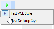
If you are building a Metropolis UI style, choose:
- Test FireMonkey Style to see how the basic controls appear in Metropolis UI style
- Test FireMonkey Metropolis UI Desktop Style to see the new controls specific to Metropolis UI
Add Object Template Button
The Add Object Template button allows you to add object templates to the style. Each object template includes the appropriate ready-to-use structure of the object. You only need to rename the object and assign properties as you prefer. The Params field, which is populated automatically, contains directives for the style converter about how to create the real style-object in the resulting style. For example, if the style converter see [CHANGEPRESSEDOPACITY] in the Params field, then it uses a special TActiveLayout object.
When you click one of the Add Object Template Buttons, the object template is added at the end of the Objects tree and is given a generic name, such as StyleObject<n>_Button after you click Add Button.
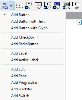
Add Object Template Commands:
| Button | Description |
|---|---|
|
Add Button |
Adds a generic button to the current style. |
|
Add Button with Text |
Adds a generic button with text to the current style. |
|
Add Button with Glyph |
Adds a generic button with a glyph or icon to the current style. |
|
Add CheckBox |
Adds a check box to the current style. |
|
Add RadioButton |
Adds a radio button to the current style. |
|
Add Label |
Adds a label to the current style. |
|
Add Active Label |
Adds an active label to the current style. An active label has additional functionality related to fonts. |
|
Add Edit |
Adds an edit field to the current style. |
|
Add Panel |
Adds a panel to the current style. |
|
Add ProgressBar |
Adds a progress bar to the current style. |
|
Add TrackBar |
Adds a track bar to the current style. |
|
Add Switch |
Adds a switch to the current style. |
Objects with Text Info Buttons
The Objects with Text Info buttons are located on the right-hand section of the toolbar:
These buttons perform the following tasks:
| Button | Object | Description |
|---|---|---|
|
T |
StyleObject |
Inserts a simple object that you can use as a container or a simple object with color or font data. |
|
Tx1 |
BitmapObject |
Inserts an object that has one bitmap state (for example, panels, toolbars). |
|
Tx2 |
ActiveObject |
Inserts an object that has two font states (active font and disabled font - only used for VCL styles). |
|
Tx2 |
ActiveBitmap |
Inserts an object that has two bitmap states (bitmap or activebitmap - for example, menu items). |
|
x3 |
SystemButton |
Inserts an object for the title of the form with three states (min, max, close buttons). |
|
x5 |
ButtonObject |
Inserts an object that has five bitmap states (disabled, enabled, hot, pressed, focused - for example, button). |
|
Tx5 |
TextObject |
Inserts an object that has five font states (disabled font, enabled font, hot font, pressed font, focused font). |
Context Menu Commands for Editing Objects
The context menu for the Objects Tree contains some useful commands for editing objects.
Automatically Adjusting Resolutions
Using the context menu, you can automatically update a selected object for different resolutions (with automatically adjusting Bitmap and Margin properties). You just set these two properties for 1x resolution objects only. If the object also has objects for other resolutions (Face20x for 2x resolution, for example), right-clicking the object and selecting Automatically Adjust Object for All Graphic Resolutions in the context menu automatically adds new objects as needed and sets all the properties for the objects (for Face20x, for example).
To create objects for other resolutions, see #Style Menu.
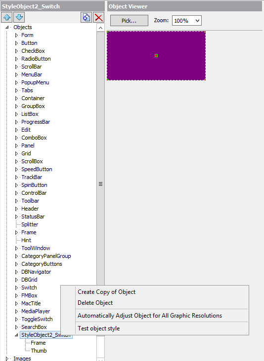
Testing Your Custom Style Objects
You can individually test custom objects. If you added a custom object (for example, “smallswitch”), then you can test only this object with different graphic resolutions. Just call a Test object style command from the context menu for the object.
