FMX.ListView.TListViewBase.NativeOptions
Delphi
property NativeOptions: TListViewNativeOptions read FNativeOptions write SetNativeOptions default [];
C++
__property Fmx::Listview::Types::TListViewNativeOptions NativeOptions = {read=FNativeOptions, write=SetNativeOptions, default=0};
Properties
| Type | Visibility | Source | Unit | Parent |
|---|---|---|---|---|
| property | public | FMX.ListView.pas FMX.ListView.hpp |
FMX.ListView | TListViewBase |
Description
Set of properties to customize the appearance and behavior of the list view when ControlType is Platform.
This group of properties provides the subproperties described in the following table. All subproperties are disabled by default.
| Subproperty | Description | ||||||
|---|---|---|---|---|---|---|---|
|
|
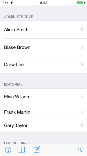
Make cells use a grouped style. The grouped style is the style that the list of iOS settings uses.
| ||||||
|
|
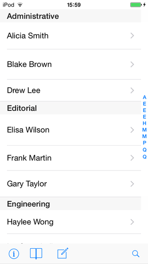
Shows an index on the right-hand side of the list with the first letter of each header. You may tap a letter to navigate to the header that the letter represents. If you want to display something other than the first letter of each header, use the IndexTitle of each header item to define a custom text to show for that header. Long index titles may hide important information behind them, use no more than few characters.
| ||||||
|
|
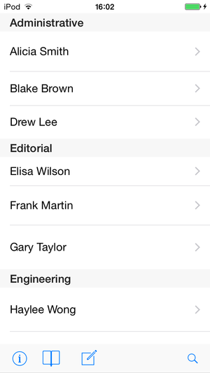
Make the native presentation use the style settings defined in your list view control for the following aspects of your list view:
You cannot customize any other aspects of the native presentation of a list view. If you need to customize your list view further, change ControlType to
|
