Object Inspector
The Object Inspector widget lets you configure the components of your application: set up their properties and associate handlers to their events.
Contents
Content
Content for the Designer
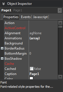
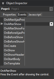
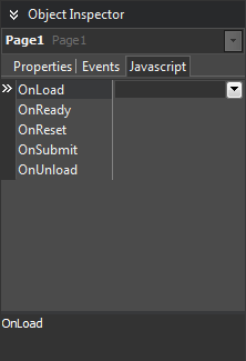
The Object Inspector displays a list of server-side properties and events and client-side events for the current selected component in the Designer.
Usage
Set Property Values
Properties can:
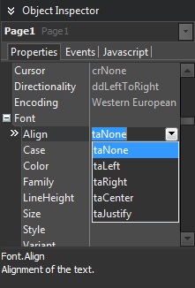
- Give you a drop-down list of valid predefined values for you to choose.
- Have an ellipsis button that, when clicked, shows a dialog where you can set the property.
- Hide its content (for passwords).
Press Enter in a property field to store its new value. When you change the value of a property, the visual designer is immediately updated to reflect that change. If the focus came from the Designer (a key was pressed directly on the Designer), it will be brought back to the Designer.
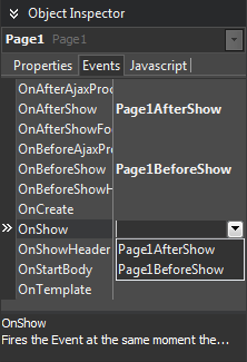
Manage Events
Double-click or press Enter after selecting an event or JavaScript event to generate an empty event for it.
When you drop down a combo box for an event or JavaScript event, it displays a list of existing event handlers for it.
Features
Linked Properties
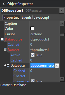
The Object Inspector supports linked properties, that is, properties that make a reference to another component in the same form, or in another form or data module. A linked property can be expanded to show the properties of referenced components, and there is no limit on how deep these levels can go. If the Name property is changed, the uniqueness of it must be checked to be unique on the owner form.
Superproperties
Certain properties actually group other properties. These superproperties are displayed in the Object Inspector in a tree structure, allowing you to collapse and expand them.
Property Editors
Complex properties require complex values. HTML5 Builder provides property-specific editors that speed up and improve the experience of defining menu trees, colors or images.
Settings
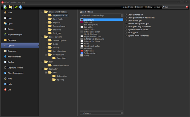
You can change Object Inspector settings from Home > Options > Environment Options > Object Inspector.
- SpeedSettings
- Displays a drop-down list box to choose from the following color schemes:
- Custom colors and settings
- Default colors and settings
- Traditional colors and settings
- Classic colors and settings
- Visual Studio(TM) emulation
- Show instance list
- Displays the Instance List, a drop-down list of components and their class names at the top of the Object Inspector. Instance List is specially useful when you have many components on your form or data module and find it too difficult or time-consuming to find the one you are looking for.
- Show classname in instance list
- Displays component class name for every component in the Instance List, not just the first one.
- Show status bar
- Displays a status bar at the bottom of the Object Inspector. This status bar indicates how many properties or events are not shown as a result of right-clicking the Object Inspector and selecting View. If all properties or events are visible in the Object Inspector, it says All shown.
- Render background grid
- Adds horizontal background lines to designate columns and rows in Object Inspector tabs.
- Show read only properties
- Displays component properties even if those properties are read-only. By default, they are grayed out.
- Bold non default values
- Displays non-default values as bold text in the current Non Default Value color setting.
- Show gutter
- Draws an outline along the left edge of the Object Inspector, and fills the outlined area with the current Gutter Color setting for additional readability.
- Colors
- To customize one of the imported color schemes, select it from the SpeedSettings list. Then select an option, and select a different color from the drop-down list below.
- For example, to change the color of Value, the text color for property values, select Value and click clYellow from Options list. Click OK to save the changes. This saves the changes to Custom colors and settings scheme, leaving the original scheme unmodified.
- To return to your default color scheme, click Default colors and settings or one of the other schemes.
- Expand inline
- Displays referenced component properties. To access these properties, click the plus sign (+) next to the referenced component. By default, referenced components are in red, and their properties in green.
- Show on events page
- Displays referenced component events. By default, referenced components are in red, and their events in green.
