Quick Configuration (VCL)
Go Up to Form Designer
VCL offers you different Quick Configuration options, these features are available according to the object you need.
Contents
Quick Edit
The Quick Edit feature allows you to easily edit a control by changing its name, caption, alignment, layout, and color options.
To edit a control:
- Right-click the component and click Quick Edit to open the dialog box with further settings.
- To edit the control name, type the new name in the Name box.
- To edit the text displayed on the control, type the text in the Caption/Text box.
- Note: This option is not available for controls that do not display the Caption or the Text property.
- Click Align to modify the alignment of the component.
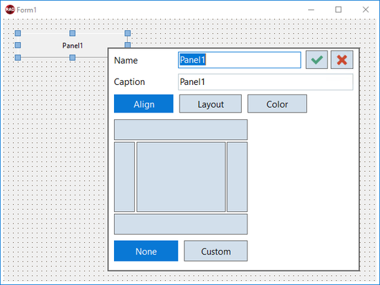
- The first group of buttons (top, bottom, left, right, and center) specifies and illustrates the Align property value and behavior. The second group of buttons contains None and Custom buttons for
alNoneandalCustomvalues.
- Click Layout to configure the margin and padding settings for the component.
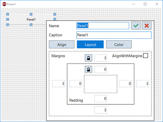
- Enter the required values for Margins and Padding in the corresponding fields, which are distributed to illustrate their respective effect in the layout. Select the Align with Margins option to use the AlignWithMargins property, which specifies whether a control should be constrained by margins.
- Select the
 icon to automatically apply a specific value to all fields while editing only one field (margin or padding).
- Click Color to modify the color of the component.
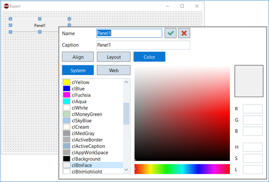
- From the Color Quick Edit option you can modify the color of the component.
- Choose a color from the pre-defined System or Web color palettes. You can also use the color picker or the HSL and RGB values to define a color.
- Click the
 icon or press Enter to save the changes.
- Note: Press Escape, click outside the dialog box, or click the
 icon to discard the changes.


Quick Button Configuration

The Quick Button Configuration feature allows you easily set up some of the TButton’s properties, such as
- Caption is the TButton’s text. Change it as you prefer.
- Keyboard Interaction, you can select Default, Cancel, or both of them.
- Special Templates, you can choose one of the six button templates OK, Cancel, Help, Yes, No, and Close.
- Modal Result that sets the action when clicking the button you can choose among 12 predefined actions.
Besides, the Quick Button Configuration offers you a Preview of the final appearance of your button.
Access the Quick Button Configuration following the steps below:
- Select and right-click the TButton object.
- When the menu displays, select Quick Button Configuration…
Also, you can access it by selecting the TButton object and clicking Quick Button Configuration… below the Object Inspector.
Quick RadioGroup Configuration

The Quick RadioGroup Configuration feature allows you easily set up some of the RadioGroup properties, such as
- Caption which is RadioGroup’s title. Change it as you prefer.
- Columns that allows you to set the column number from one to ten.
- Items that are the radio button’s names. Add a new one using newline separators.
- Preview section that changes every time a RadioGroup property changes.
Finally, you can find a Preview area where you can check the appearance of the RadioGroup every time a property changes, besides three buttons that allows you to perform the following tasks:
- Load... loads text files with multiple lines from your local computer. Each line becomes an item.
- Clear deletes all your items.
- OK saves all your RadioGroup configuration.
- Cancel closes the windows avoiding saving any of your new configurations.
Access the Quick RadioGroup Configuration following the steps below:
- Select and right-click the TRadioGroup object.
- When the menu displays, select Quick RadioGroup Configuration…
Also, you can access it by selecting the object and clicking Quick RadioGroup Configuration… below the Object Inspector.
Quick Panel Configuration

The Quick Panel Configuration feature allows you easily set up some of the Panel’s properties, such as
- Caption that is the Panel’s text. Change it as you prefer.
- Widths change the border or bevel widths. To do so, select Border or Bevel and choose a width for each.
- Bevel configures the panel’s bevel appearance in different ways by
- Kind applies a border. You can pick from bkNone, kbTile, kbSoft, and kbFlat.
- Inner applies an inner bevel to the panel. You can choose from bvNone, bvLowered, bvRaised, and bvSpace.
- Outer applies an outer bevel to the panel. You can select from bvNone, BvLowered, bvRaised, and bvSpace.
- Remove Border and Bevel.
Besides, the Quick Panel Configuration shows you a Preview of your panel while you are configuring it.
Access the Quick Panel Configuration following the steps below:
- Select and right-click the TPanel object.
- When the menu displays, select Quick Panel Configuration…
Also, you can access it by selecting the object and clicking Quick Panel Configuration… below the Object Inspector.