Mobile Tutorial: Using ListBox Components to Display a Table View (iOS and Android)
Go Up to Mobile Tutorials: Mobile Application Development (iOS and Android)
Contents
Using ListBox Components to Display a Table View in Mobile Platforms
On the mobile platform, FireMonkey uses the FMX.ListBox.TListBox component to present a Table View in a mobile style, like the following ListBoxes.
Note: FMX.ListBox.TListBox performance can be slow on mobile. Use TListView if you want to develop more complex applications, especially apps with large databases.
Plain List
| iOS | Android (LG E-612) |
|---|---|
|
|
|


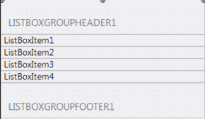
Grouped List

Search Box
You can add a search box to a ListBox. With a search box, users can easily narrow down a selection from a long list as in the following pictures.


This tutorial describes the basic steps to build items for a Table View in your multi-device applications for mobile platforms.
Create Items on the ListBox Component
- Select:
- For Delphi: File > New > Multi-Device Application - Delphi > Blank Application
- For C++Builder: File > New > Multi-Device Application - C++Builder > Blank Application
- Select the TListBox component in the Tool Palette, and drop it on the Form Designer. To find TListBox, enter a few characters (such as "TList") in the Search box of the Tool Palette:
- Select the TListBox component on the Form Designer, go to the Object Inspector and select Client for the Align property.
- On the Form Designer, right-click the TListBox component, and select Items Editor:
- On the Items Designer, click the Add Item button several times to add several items to the ListBox:
- Close the Items Designer. Now you can find your ListBox Items on the TListBox component. For example:


Add a Header
You can define a Header on the TListBox component by using the following steps:

- On the Form Designer, right-click the TListBox component, and select Add Item > TListBoxHeader:
- On the Tool Palette, select the TLabel component and drop it on top of the TListBoxHeader component you just added:
- In the Object Inspector, change the properties of the TLabel component as follows:


Property Value Align Client StyleLookup toollabel TextSettings.HorzAlign Center Text (Text value as you want)
You can define a Group Header and a Group Footer for items on TListBox as follows:

- On the Form Designer, right-click the TListBox component, and select Items Editor.
- On the Item Designer, select TListBoxGroupHeader from the drop-down list, and then select Add Item:
- Select TListBoxGroupFooter from the drop-down list, and then select Add Item.
- Select ListBoxGroupHeader1 in the list of items, and click the Up button several times until this item becomes the top item on the list:
- Close the dialog box. Now you have a Group Header and a Group Footer on the TListBox component.


Show List Items as Separate Grouped Items
Items on a ListBox can be shown as either a Plain list or a Grouped list. This choice is controlled by the GroupingKind property and the StyleLookup property, as shown in the following graphic:
Show Items as Plain List Show Items as Grouped List 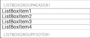
Plain = GroupingKind Property Value Grouped = GroupingKind Property Value listboxstyle = StyleLookup Property Value transparentlistboxstyle = StyleLookup Property Value

You can select the GroupingKind property and the StyleLookup property in the Object Inspector when the ListBox is selected in the Form Designer.
Add a Check Box or Other Accessory to a ListBox Item
Each item in a TListBox can use an Accessory such as Check Mark through the ItemData.Accessory property. The following picture shows the value you can assign to ItemData.Accessory and the Accessory assigned:

You can select the Accessory property in the Object Inspector when ListBox Item is selected in the Form Designer.

Add an Icon to a ListBox Item
Each Item on a ListBox component can contain Bitmap data, as an Icon, through the ItemData.Bitmap property:

You can select the Bitmap property in the Object Inspector when the ListBoxItem is selected in the Form Designer.
In order to view the Icon, you must select a StyleLookup which supports the Bitmap property. Change the StyleLookup property to listboxitemleftdetail.
Add Detail Information to an Item
You can add additional text information to each item on the ListBox component.
Specify additional text in the ItemData.Detail property, and select the location of the Detail Text through the StyleLookup property, as shown in the following table:
StyleLookup property Look & Feel listboxitemnodetail 
listboxitembottomdetail 
listboxitemrightdetail 
listboxitemleftdetail 
Running Your Application
Run the application either by choosing Run > Run or by pressing F9.
Create Your ListBox Application
- Select:
- For Delphi: File > New > Multi-Device Application - Delphi > Blank Application
- For C++Builder: File > New > Multi-Device Application - C++Builder > Blank Application
- Select the TListBox component in the Tool Palette, and drop it on the Form Designer.
- Select the TListBox component on the Form Designer, go to the Object Inspector and select Client for the Align property.
Add Items to a ListBox from Your Code
To add regular items to a ListBox, you can simply call the Items.Add method as shown in the following code snippet:
- Delphi:
ListBox1.Items.Add('Text to add');
- C++:
ListBox1->Items->Add("Text to add");
If you want to create items other than a simple item, or control other properties, you can create an instance of the item first, and then add it to the list box.
The following sample codes add items to a ListBox, as shown in the picture:
| iOS | Android (LG E-612) |
|---|---|
|
|
|


Delphi:
procedure TForm1.FormCreate(Sender: TObject);
var
  c: Char;
  i: Integer;
  Buffer: String;
  ListBoxItem : TListBoxItem;
  ListBoxGroupHeader : TListBoxGroupHeader;
begin
  ListBox1.BeginUpdate;
  for c := 'a' to 'z' do
  begin
    // Add header ('A' to 'Z') to the List
    ListBoxGroupHeader := TListBoxGroupHeader.Create(ListBox1);
    ListBoxGroupHeader.Text := UpperCase(c);
    ListBox1.AddObject(ListBoxGroupHeader);

    // Add items ('a', 'aa', 'aaa', 'b', 'bb', 'bbb', 'c', ...) to the list
    for i := 1 to 3 do
    begin
      // StringOfChar returns a string with a specified number of repeating characters.
      Buffer := StringOfChar(c, i);
      // Simply add item
      // ListBox1.Items.Add(Buffer);

      // or, you can add items by creating an instance of TListBoxItem by yourself
      ListBoxItem := TListBoxItem.Create(ListBox1);
      ListBoxItem.Text := Buffer;
      // (aNone=0, aMore=1, aDetail=2, aCheckmark=3)
      ListBoxItem.ItemData.Accessory := TListBoxItemData.TAccessory(i);
      ListBox1.AddObject(ListBoxItem);
    end;
  end;
  ListBox1.EndUpdate;
end;
C++:
void __fastcall TForm1::FormCreate(TObject *Sender)
{

  char c;
  int i;
  String Buffer ;
  TListBoxItem *ListBoxItem  ;
  TListBoxGroupHeader *ListBoxGroupHeader  ;

  ListBox1->BeginUpdate();
  for (c = 'a'; c <= 'z'; c++)
  {
        // Add header ('A' to 'Z') to the List
        ListBoxGroupHeader = new TListBoxGroupHeader(ListBox1);
        ListBoxGroupHeader->Text = UpperCase(c);
        ListBox1->AddObject(ListBoxGroupHeader);

        // Add items ('a', 'aa', 'aaa', 'b', 'bb', 'bbb', 'c', ->->->) to the list
        for (i = 1; i < 4; i++)
        {
          // StringOfChar returns a string with a specified number of repeating characters->
          Buffer = StringOfChar(c, i);
          // Simply add item
          // ListBox1->Items->Add(Buffer);

          // or, you can add items by creating an instance of TListBoxItem by yourself
          ListBoxItem = new TListBoxItem(ListBox1);
          ListBoxItem->Text = Buffer;
          // (aNone=0, aMore=1, aDetail=2, aCheckmark=3)
          ListBoxItem->ItemData->Accessory = static_cast<TListBoxItemData::TAccessory>(i);
          ListBox1->AddObject(ListBoxItem);
        };
  };
  ListBox1->EndUpdate();
}
Create an Overflow Menu
An overflow popup menu is accessed via the Action Bar and is used to provide access to additional items or items that are used less often.
In FireMonkey, you can easily implement an overflow menu using TListBox:
- Add a TToolBar component on the form and set the alignment to Top.
- Place three TSpeedButton components on the TToolBar component:
- For the first TSpeedButton:
- Set the Align property to Left.
- Change the Name property to OrganizeButton.
- Set the StyleLookup to organizetoolbutton.
- For the second TSpeedButton:
- Set the Align property to Right.
- Change the Name property to OverflowButton.
- Select detailstoolbutton for the StyleLookup property.
- For the last TSpeedButton:
- Set the Align property to Right.
- In Object Inspector expand the Margins node and set the Right margin to 5.
- Change the Name property to SearchButton.
- Set the StyleLookup to searchtoolbutton.
- Drop a TListBox to the form.
- For the first four TListBoxItem components in TListBox go to Object Inspector, expand ItemData:
- Define the Bitmap property.
- Change the Text property to the text value that you want.
- Select listboxitemleftdetail for the StyleLookup property.
- For the last TListBoxItem, in the Object Inspector expand ItemData:
- Add a TShadowEffect component to the overflow menu.
| Structure View | Android LG-E612 |
|---|---|
|
|
|


Creating the Event Handler for the Overflow Button
In the Form Designer, double-click the OverflowButton component. Add the following code to this event handler:
- Delphi:
procedure TForm1.OverflowButtonClick(Sender: TObject);
begin
OverflowMenu.Visible := not OverflowMenu.Visible; //change the visibility status
  if OverflowMenu.Visible then // the Overflow Menu is displayed
  begin
    OverflowMenu.BringToFront;
    OverflowMenu.ItemIndex := -1; //  the ItemIndex property specifies the currently selected item(default value is -1 that means that no item is selected)
    OverflowMenu.ApplyStyleLookup;
    OverflowMenu.RealignContent; // realigns the children TListBoxItem controls of the OverflowMenu TListBox
  end;
end;
- C++:
void __fastcall TForm1::OverflowButtonClick(TObject *Sender)
{
        OverflowMenu->Visible = !(OverflowMenu->Visible); //change the visibility status
		if (OverflowMenu->Visible) {   // the Overflow Menu is displayed
                OverflowMenu->BringToFront();
                OverflowMenu->ItemIndex = -1; //  the ItemIndex property specifies the currently selected item(default value is -1 that means that no item is selected)
                OverflowMenu->ApplyStyleLookup();
                OverflowMenu->RealignContent(); // realigns the children TListBoxItem controls of the OverflowMenu TListBox
        }
}
Add a Search Box
- To add a Search Box to the ListBox component, right-click the TListBox component and simply select Add Item > TSearchBox from the context menu:

- To add it to the Action Bar:
- Set the Visible property to False.
- To create the event handler for the SearchButton, double-click it and add the following code:
Delphi:
procedure TForm1.SearchButtonClick(Sender: TObject);
begin
  SearchBox1.Visible := not SearchBox1.Visible; //change the visibility status
end;
C++:
void __fastcall TForm1::SearchButtonClick(TObject *Sender) {
        SearchBox1->Visible = !(SearchBox1->Visible); //change the visibility status
}
Running Your Application
- Select either:
- Run > Run
- Run > Run Without Debugging
- To invoke the overflow menu, click the vertical ellipsis on the Action bar.
- To view the search box, click the SearchButton.
| Android (Samsung Tab 2.0) | Android (Samsung Tab 2.0) |
|---|---|
|
|
|
|
Displaying the overflow menu |
Displaying the search box |


See Also
- FMX.ListBox.TListBox
- Mobile Tutorial: Using LiveBindings to Populate a ListView (iOS and Android)
- Mobile Tutorial: Using LiveBindings to Populate a ListBox in Mobile Applications (iOS and Android)
- Mobile Tutorial: Using a Button Component with Different Styles (iOS and Android)
- Mobile Tutorial: Using the Web Browser Component (iOS and Android)
- Mobile Tutorial: Using Tab Components to Display Pages (iOS and Android)