User:Alexandrab/Mobile Tutorial: Using a Button Component with Different Styles (iOS and Android)
Go Up to Mobile Tutorials: Mobile Application Development (iOS and Android)
Contents
Buttons in FireMonkey Mobile Applications
FireMonkey defines various types of buttons, and you can use these different types of buttons with the same steps described here. The FireMonkey buttons include TButton and TSpeedButton.
Following are some examples of different styles with Button components available for you to use in different parts of the user interface of your mobile application:
- Buttons on the Form:
| iOS | Android |
|---|---|
|
|
|
|
|
|


- Buttons on the Navigation Bar (also known as Toolbar):
| iOS | Android |
|---|---|
|
|
|
|
|
|
|
|
|
|
|
|
|
|
|
|
|
|
Define the Look and Feel for a Button Component
After you place a new button on the FireMonkey Mobile Designer, you can specify some important properties for a selected component by using the Object Inspector.
Select a component (in this case, a button), and then browse and change the value of some properties as follows:
- Change the text displayed on the button surface by updating the value of the Text property.
- Change the value of the Position.X and Position.Y properties (or drag the component using your mouse.)
- Change the value of the Height and/or Width properties (or drag the edge of the component using your mouse.)
- Click the down-arrow in the StyleLookup property.
- In the StyleLookup drop-down list, you can select a predefined Style based on how your component is to be used:
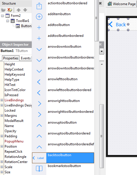
- In the StyleLookup drop-down list, you can select a predefined Style based on how your component is to be used:

Create a Segmented Control Using Button Components
FireMonkey uses a SpeedButton component to define the Segmented Control, which gives users the ability to select one value from several options.
| iOS | Android |
|---|---|
|
|
|
To define a Segmented Control, use the following steps:
- 1. Place three TSpeedButton components from the Tool Palette. Place the TSpeedButton components next to each other using your mouse:
| iOS | Android |
|---|---|
|
|
|


- 2. Select the first component, and change its StyleLookup property to segmentedbuttonleft:
| iOS | Android |
|---|---|
|
|
|


- 3. Select the second component, and change its StyleLookup property to segmentedbuttonmiddle.
- 4. Select the third component, and change its StyleLookup property to segmentedbuttonright. Now all three buttons look like a Segmented Control:
| iOS | Android |
|---|---|
|
|
|


- 5. Select each component, and change the Text property as you like:
| iOS | Android |
|---|---|
|
|
|


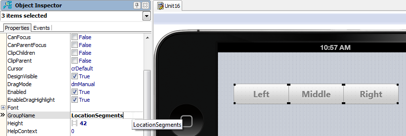
- 6. Click and drag these three buttons to select these components:
| iOS | Android |
|---|---|
|
|
|


- 7. Set the GroupName property to a unique name such as LocationSegments:
- 8. To specify that one of these components is to appear as Pressed by default, set the IsPressed property for one component to True:

| iOS | Android |
|---|---|
|
|
|
Create a Scope Bar on a Toolbar Component
You can define a Segmented Control on a toolbar; this is also known as a Scope Bar, a segmented control that can be used to control the scope of a search.
Use the same TSpeedButton controls as in the previous steps, but with the following values for the StyleLookup property:
- toolbuttonleft
- toolbuttonmiddle
- toolbuttonright
| iOS | Android |
|---|---|
|
|
|
See Also
- Mobile Tutorial: Creating an Application for Mobile Platforms (iOS and Android)
- Mobile Tutorial: Using a Calendar Component to Pick a Date (iOS and Android)
- Android Mobile Application Development
- FMX.Mobile.iOSControls Sample
- FMX.StdCtrls.TButton
- FMX.StdCtrls.TSpeedButton
- FMX.Controls.TStyledControl.StyleLookup
- FMX.StdCtrls.TToolBar