Using VCL TControlList Control
Go Up to VCL
We introduced in the VCL library a new flexible and virtualized list control. The idea behind this control is to provide a new modern looking VCL control, offering custom UI configuration and a high performance control, which can be used with very long lists. This list represents a single selection list and all items are visually of the same height and width.
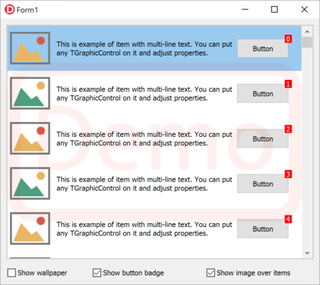
The new control allows the developer to define the content by designing one of the elements of the list using graphical controls (that is, TGraphicControl descendants) and provide data to the control to display individual elements, without creating all of the controls for all of the elements in the list, but only those needed to display the data. Being totally virtual, the list can handle thousands and even millions of items, offering extremely fast scrolling. Besides calculating and displaying only the items that fit on screen, the list caches the content of the items using in-memory bitmaps.
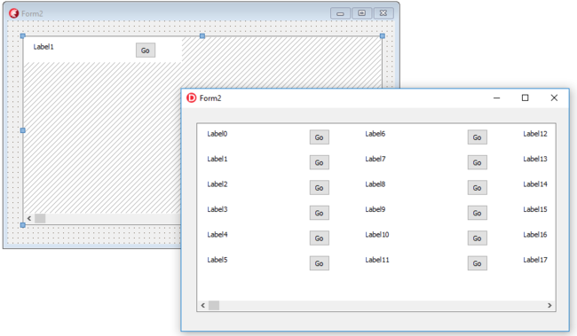
The new control resembles the classic TDBCtrlGrid control -- there is a panel for controls, you put controls on it and have virtual items created at run time. Unlike TDBCtrlGrid we can put only TGraphicControl on it and all items are virtual. Below you can see the control at design time (with the surface of a single item available for editing), and at runtime (with the same content multiplied many times).

This list does not include a collection of items with specific information. The data can be provided either via live bindings (including binding to a dataset or a collection of objects) or via an event to query for the data of an individual item (so that the direct storage and mapping would be completely up to the developer).
The control offers different events to set properties, enable and change visibility for hosted controls for each item. With special properties you can adjust the selection for different item states and additional properties allow you to automatically adjust the colors of the labels when an item is selected.
procedure TForm2.ControlList1BeforeDrawItem(AIndex: Integer;
  ACanvas: TCanvas; ARect: TRect; AState: TOwnerDrawState);
begin
  Label1.Caption := 'Label' + AIndex.ToString;
end;
At design time, there is a special dialog with a collection of preset configurations, which include adjustment for TControlList properties and control collections with specific properties. You use the arrows at the top to pick the core configuration and you can fine tune it with some of the other checkbox options at the bottom. The wizard overrides the control list setting.

The item you design is replicated virtually for each of the items requested with the ItemCount property. The visible surface of the control generally allows a number of items, all with the same width and height. The control has 3 different layouts:
- Single for a single columns of items, in which case the width of the item will match with the control width.
- Multi Top To Bottom allows for multiple columns and will use the available vertical space before moving to the next column, offering vertical scrolling.
- Multi Left To Right also allows for multiple columns but uses a different layout and horizontal scrolling mode (see image below).
If you configure the list in the earlier demo for multiple columns you can set the items width to a value other than zero and obtain the output in the following image (again at design time and runtime):
All items are virtual. The control has excellent performance and you can have over a million items without any problem. Special code defines visible items, and their positions in real time using scroll information. Only visible items are processed.
In general terms, you can use the OnClick event for any control on the control list. The control supports High-DPI options and VCL Styles and it is fully Live Bindings enabled.
Contents
The new TControlListButton component
We cannot use TSpeedButton directly on the panel, because the control does not handle special interactions like button changed state. For controls, which can have different states, we added a special TControlListControl class, inherited from TGraphicControl. You can create new controls that inherit from TControlListControl class and can use mouse events for their items. This is the approach used by TControlListButton, the analogue of a TSpeedButton that can be used with TControlList. This button has 3 styles: push button, tool button, and link.
List of TControlList Component Properties
|
Defines the number of items |
|
Defines background color of an item |
|
Index of active item |
|
Defines width of the item (when set to 0, it uses the entire width of the control) |
|
Defines height of the item |
|
Defines margins between items |
|
Custom validation of input char |
|
Defines selection and text colors for item states, using of the the following values: - cltSingle - cltMultiTopToBottom - cltMultiLeftToRight |
|
Index of hot item |
|
Set MarkDisabledItem to True for automatically drawing disabled content of disabled item |
List of TControlList Component Events
|
Event to define property of controls and background drawing before drawing of item content |
|
Event to define property of controls and background drawing after drawing of item content |
|
Event to define general background drawing before drawing of all items |
|
Event to define general list drawing after drawing of all items (over all items) |
|
Item click event |
|
Item double click event |
|
Event to define enabled and disabled items |
|
Event to define enabled and disabled controls in specific item |
|
Event to show / hide controls in specific item |