Applying FireMonkey Image Effects
Go Up to FireMonkey Image Effects
FireMonkey effects are nonvisual components that can be found in the Effects category on the Tool Palette. An effect has a visual result only if it is the child of a visual component. You can apply effects over any 2D component. Image effects do not work with 3D controls; however they do work with TViewport3D, a 2D control that displays 3D content.
Contents
Applying FireMonkey image effects over visual components
To apply an effect, follow the steps:
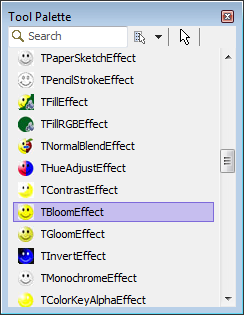
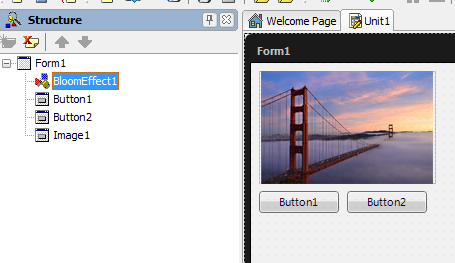
- 1. In the Tool Palette, double-click the effect you want. This adds the effect to the form. You can see the added effect in the Structure View as the child of the form itself:
|
Effects in Tool Palette |
Effect added to a form |
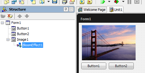
- 2. In the Structure View, drag the effect under the component to which the effect should be applied. Now the effect is the child of a visual component, in this case Image1:
|
The TBloomEffect is applied over an image |
Customizing Effect Properties
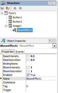
Almost all the effects have specific properties that you can customize depending on the application. The properties can be found in the Object Inspector when the effect is selected in the Structure View:
|
TBloomEffect properties |
When an effect is applied, all the pixels of the component are affected. The visual result depends on the pixels of the component to be customized. For example, the effects that are particularly alpha-aware do not change the transparent pixels. The visual result of an effect can be increased by changing the effect's specific properties.
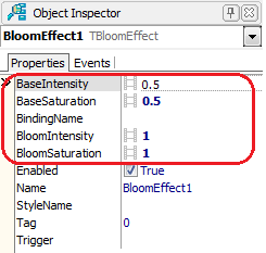
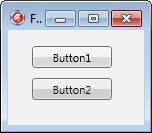
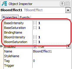
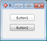
In the next example, the TBloomEffect is applied over Button1, and Button2 has no effect applied. Because the default colors of the button are already bright, the TBloomEffect, with the default values for its properties, does not have a visible result. But if you change the TBloomEffect properties, the result becomes visible:
| Properties | Result |
|---|---|
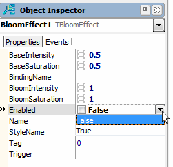
By default, the Enabled property of any effect is set to True, and the effect is applied right after a visual component becomes its parent. An effect's Enabled flag can be set programmatically or in the Form Designer:
| Set Enabled in Object Inspector | Set Enabled programaticaly |
|---|---|
|
Delphi: BloomEffects1.Enable := False;
C++: BloomEffects1->Enable = false;
|
Setting Effect Triggers
Image effects can be triggered from property changes, setting the Enabled flag in response. Triggers do not work with every arbitrary property, but only with particular properties that are checked during the component's internal event processing. All built-in triggers check boolean properties, and by convention the names of these properties start with "Is".
TControl provides four triggers for every control and shape:
- IsDragOver
- IsFocused
- IsMouseOver (requires HitTest set to
True) - IsVisible
Other built-in triggers include:
- IsActive (TCustomForm)
- IsChecked (TMenuItem)
- IsOpen (TEffect)
- IsPressed (FMX.StdCtrls.TCustomButton)
- IsSelected (TMenuItem, TTabItem, TListBoxItem, TTreeViewItem)
Note: A slightly different set of triggers is provided for animation effects. FMX.Controls.TControl defines the procedures StartTriggerAnimation, StartTriggerAnimationWait, and StopTriggerAnimation in addition to ApplyTriggerEffect.
Effects can be set to apply when any of these properties change as the result of code or user action. When the trigger condition no longer holds, the effect is removed. Trigger conditions are limited to equality checks, and if the trigger contains more than one condition, they must all evaluate to true for the trigger to fire.
A trigger is expressed as a string containing one or more trigger conditions, separated by semicolons. Each trigger condition consists of the property name, an equal sign, and the trigger value. All the built-in triggers are boolean, so their value must be either True or False. For example:
Delphi:
IsMouseOver := True;
IsPressed := False;
C++:
IsMouseOver = true;
IsPressed = false;
Trigger conditions are stored in the Trigger property.
Animating Effects
A few very simple image effects like TInvertEffect have no additional properties; they are either enabled or disabled. But most effects have properties that control aspects of their behavior, like a numeric strength or count. In particular, transitions have a Progress property, a percentage from zero to 100. A TFloatAnimation can be attached to these properties in code or through the Object Inspector to create dynamic visual effects. To animate the progress of the transformation, see Apply an Animation Effect to a Property of an Image Effect.
