Using the Card Panel Component
Go Up to VCL
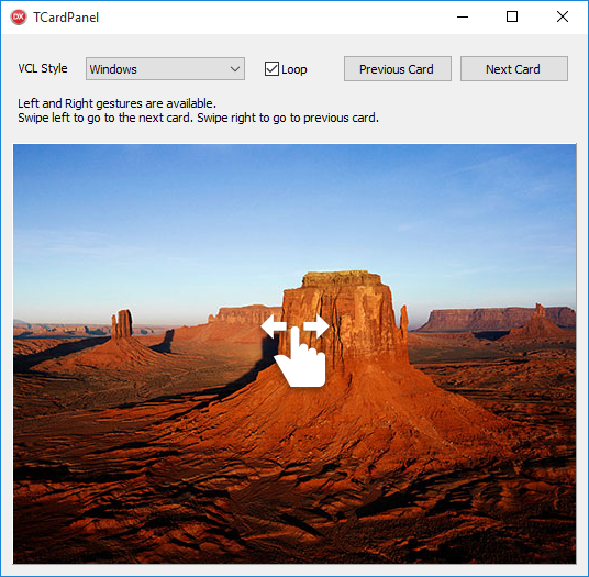
TCardPanel allows you to display a collection of cards or pages (TPanel controls) that can be displayed one at a time. The control displays the active card and its content and you can write code to switch to any other card or use the integrated mechanism to let a user move among cards sequentially with a swipe gesture. A Card Panel hosts multiple subpanels displaying only one of them, similarly to a TabControl, but it has no specific UI indicating the various panels.
TCardPanel fully supports VCL styling for Windows 10 and previous versions of Windows.
Adding and selecting Cards
TCardPanel allows you to add new Cards and select existing Cards using the following options:
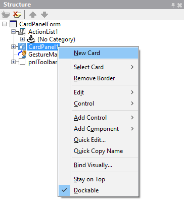
- Right-click the Card Panel component in the Structure view to dispaly the New Card and Select Card options.
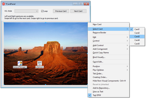
- Right-click the Card Panel component in the Design view to display the New Card and Select Card options.
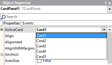
- Use the ActiveCard property to select a Card from the Cards you create in the Card Panel.
Modifying order and visibility
Select the Card from the Structure view to modify its order and visibility settings.
- Change the value of the CardIndex property to modify the order in which the Card Panel displays the cards.
- Set the CardVisible property to False to disable the visibility of the card.
Changing Styles
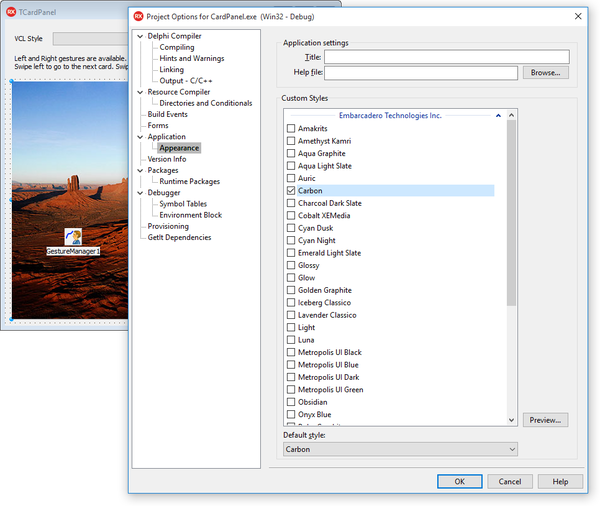
TCardPanel allows you to set custom styles. You can choose from a variety of VCL Styles and apply a selected style in a few steps:
- Click Options in the Project menu to open the Project Options dialog box.
- Click Application in the left-hand panel and select Appeareance.
- Select a style from the list of Custom Styles and click OK.
