Customizing the Design of a FireMonkey Application
Go Up to FireMonkey Quick Start Guide - Designing User Interface
Contents
Customizing the design of a FireMonkey application
In the Visual Component Library (VCL), you can modify the color and other look and feel-related properties of each component from the Object Inspector. However, you do not see such look-and-feel properties in FireMonkey. In FireMonkey, the look and feel of each component is defined in its style, and you can assign a style to a component.
Because of the idea of style, you can now easily change the look and feel of the entire application by just applying different styles to the application.
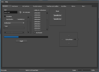
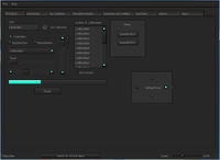
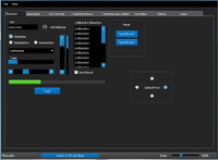
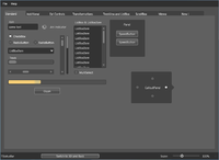
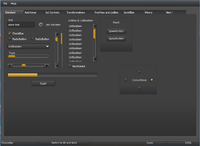
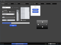
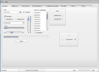
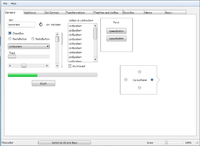
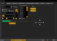
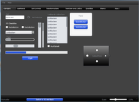
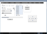
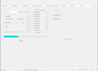
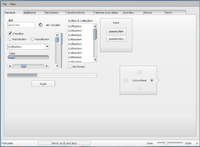
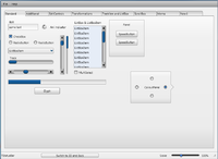
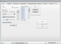
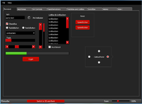
Following are predefined FireMonkey styles that you can easily use within your application:
To select a style within your application, there are several typical ways to implement a style:
- Step 1 describes how to change the style at run time using code.
- Step 2 describes how to set the style while you design your application, and how to include the specified style in your application.
- Step 3 describes how to set the style for a specific component.
Step 1: Apply the Existing Style to Your Application at Run Time
- Note: You can find a sample application at
C:\Users\Public\Documents\Embarcadero\Studio\18.0\Samples\Object Pascal\FireMonkey Desktop\ControlsDemo.
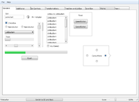
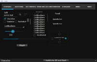
The ControlsDemo sample application has many FireMonkey components already placed, and the implementation for switching the style at run time is already implemented.
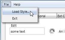
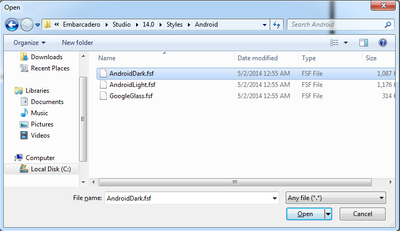
To use this functionality in this demo application, click File > Load Style…, and select a style file.
The FireMonkey style files are available at C:\Users\Public\Documents\Embarcadero\Studio\18.0\Styles.
Here is the code used to switch to a new style:
procedure TfrmCtrlsDemo.MenuItem7Click(Sender: TObject);
begin
  if OpenDialog1.Execute then
     TStyleManager.SetStyleFromFile(OpenDialog1.FileName);
end;
First, this demo code shows an Open Dialog used to select a file. The name of the dialog is set to OpenDialog1 in the code. When the user selects a file, the Execute method returns True. This code checks whether the user has selected a file. Then the TStyleManager.SetStyle procedure sets the active style to the style from the OpenDialog1.Filename file. OpenDialog1.Filename holds the file name selected by the user.
Step 2: Apply an Existing Style to Your Application at Design Time
You can also apply existing styles through the TStyleBook component at design time.
To apply a style at design time
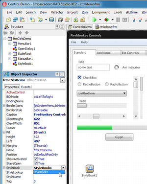
- Drop a TStyleBook component on your form. By default, the name of the new component is StyleBook1.
- Select a multi-device form, and set the StyleBook property to StyleBook1.
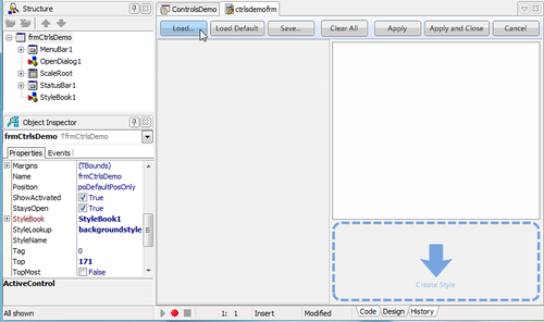
- Double-click the StyleBook1 component. The Style Designer opens.
- Click the Load button and select the style. Styles are available at
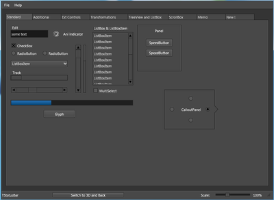
C:\Program Files (x86)\Embarcadero\Studio\18.0\styles\Fmx. - Select Apply and Close. Now controls on the Form Designer are rendered using the specified style.
- Note: Step 2 of this tutorial has changed the functionality of this demo application (discussed at Step 1). After you try this step, remove the StyleBook1 component from your application, so that the original functionality implemented in this demo will not be changed.
Step 3: Modify the Style for a Particular Component
You can also customize the style for a specific component.
To customize the style of a specific component
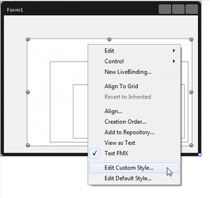
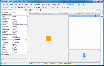
- The Style Designer opens and StyleBook1 is created. The StyleBook property of the main form is set to StyleBook1. The Structure View shows StyleBook1. In the Structure View, select the style of the control right-clicked on the Form Designer. For example, if the control is Panel1, then select panel1style1. The Object Inspector shows properties of this style.
- 3. Change the property of this particular style through the Object Inspector. You can change any property shown in the Object Inspector.
- 4. Select Apply and Close, and return to the Form Designer.
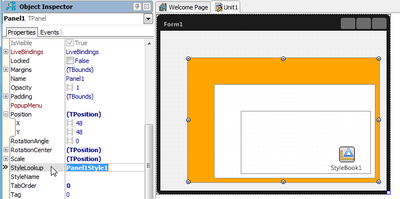
- 5. Selecting the component (whose style was just customized), you will find that the StyleLookup property obtains the name of the style just created (such as Panel1Style1).
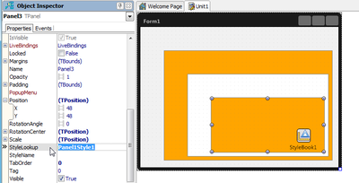
- 6. Now you can apply the same style to different components. Select another component and set the StyleLookup property to Panel1Style1.
