Customizing FireMonkey ListView Appearance
Go Up to FireMonkey Application Design
Contents
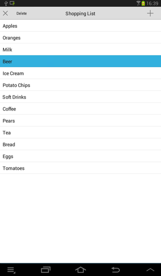
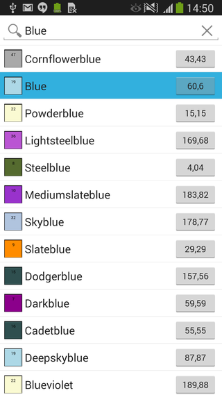
You can customize the appearance of a FireMonkey list view by modifying the layout of the list items, including the caption, the associated image, text details, or the accessory icon.
Customizing the List View Appearance Properties
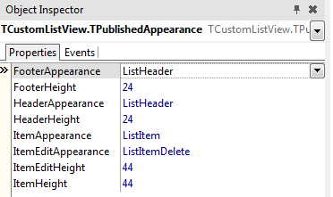
At design time, you can change the footer, header, and the list items appearance (also for the editing mode) by modifying the values of the properties in the ItemAppearance property. The ItemAppearance property controls the footer, the header, and the item appearance size (normal and in editing mode).
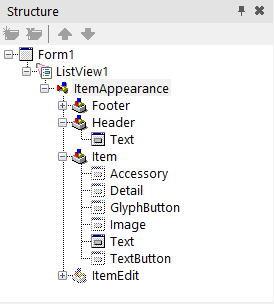
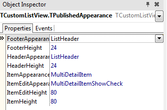
The following appearance properties of a ListView are grouped in the Object Inspector and in the StructureView, and you can modify their values to customize your list view appearance.
- FooterHeight. This property designates the list footer height (in pixels). Default value:
24. - FooterAppearance. This property designates the footer graphical appearance. Default value:
ListHeader.
Header properties
- HeaderHeight. This property designates the list header height (in pixels). Default value:
24. - HeaderAppearance. This property designates the header graphical appearance. Default value:
ListHeader.
List item properties
- ItemHeight. This property designates the item height (in pixels). Default value:
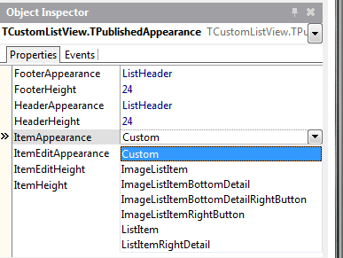
44. - ItemAppearance. This property designates the item graphical appearance (image, caption, accessory button, etc.). Default value:
ListItem.
- Choose between the following values:
| Property | Visible objects |
|---|---|
| Custom | See Using the Custom Value |
| ImageListItem | An image, a caption, and an accessory graphical button |
| ImageListItemBottomDetail | An image, a caption, a detail text, and an accessory graphical button |
| ImageListItemBottomDetailRightButton | An image, a caption, a detail text, and an accessory text button |
| ImageListItemRightButton | An image, a caption, and an accessory text button |
| ListItem | A caption and an accessory graphical button |
| ListItemRightDetail | A caption, a detail text, and an accessory graphical button |
Edited list item properties
- ItemEditHeight. This property designates the item height (in pixels) when in edit mode. Default value:
44. - ItemEditAppearance. This property designates the item graphical appearance when in edit mode. Default value:
ListItemShowCheck.
- Choose between the following values:
| Property | Visible objects |
|---|---|
| Custom | See Using the Custom Value |
| ImageListItemBottomDetailRightButtonShowCheck | An image, a caption, a detail text, a check box glyph button, and a text button |
| ImageListItemBottomDetailShowCheck | An image, a caption, a detail text, a check box glyph button, and an accessory graphical button |
| ImageListItemDelete | An image, a caption, a delete glyph button, and an accessory graphical button |
| ImageListItemRightButtonDelete | An image, a caption, a delete glyph button, and a text button |
| ImageListItemRightButtonShowCheck | An image, a caption, a check box glyph button, and a text button |
| ImageListItemShowCheck | An image, a caption, a check box glyph button, and an accessory graphical button |
| ListItemDelete | A caption, a delete glyph button, and an accessory graphical button |
| ListItemRightDetailDelete | A caption, a detail text, a delete glyph button, and an accessory graphical button |
| ListItemRightDetailShowCheck | A caption, a detail text, a check box glyph button, and an accessory graphical button |
| ListItemShowCheck | A caption, a check box glyph button, and an accessory graphical button |
How to Modify List View Appearance Properties
Use the Structure View and the Object Inspector to find the List View component.
- In the Structure View, locate the ListView component and then click ItemAppearance in the hierarchy.
- In the Object Inspector, locate the ItemAppearance property and customize the desired values.
Using the Custom Value
Custom value enables all objects of the ListView and you can select the visibility for the items in the list. You can use a Custom value for the FooterApearance, HeaderAppearance, ItemAppearance, and ItemEditAppearance properties of the items in the ListView.
You can customize these properties and set the visibility of the following graphical items for any of them:
- Accessory Object. Describes the graphical appearance of the accessory object of the list view item. You can change:
- Accessory Type: Check mark, Detail, or More accessory icon.
- Position and size.
- Note: The accessory type object is not displayed in Edit Mode.
- Detail. Describes the graphical appearance of the detail text of a list view item. You can change:
- Font type, text color and text alignment.
- GlyphButton. Describes the graphical appearance of a glyph button (graphical image) of the list view item. You can change:
- Button type: Add button, Checkbox button, and Delete button.
- Position and size.
- Enable the glyph button.
- Note: The GlyphButton is shown only in Edit Mode.
- Image. Describes the graphical appearance of the icon object of the list view item. You can change:
- Position and size.
- Text. Describes the graphical appearance of the text object of the list view item. You can change:
- Position and text size.
- Font type, text alignment, and word wrapping.
- TexButton. Describes the graphical appearance of the text button object of the list view item. You can change:
- Button type.
- Font type, text size, text alignment, and word wrapping.
- Enable the text button.
How to use the Custom Value
To use the Custom value for a list item:
- In the Object Inspector, locate the ItemAppearance property and set its value to Custom.
- Set the visibility of the desired objects:
- Enable the Visible property (by setting its value to
True) in the Object Inspector for any of the desired objects and modify the properties according to your needs. - Enable the Visible property of any of the object, by setting it to
Truein the source code.
- Enable the Visible property (by setting its value to
Delphi:
AItem.Objects.AccessoryObject.Visible := True;
C++:
void __fastcall TForm1::SetEditItemProperties( TItemAppearanceObjects * AObjects)
{
	AObjects->GlyphButton->Visible = true;
}
Create a Customized Appearance Class
You can create and install a new customized appearance class and use it in your design, by installing a new package. This package defines the classes that implement a custom appearance for list view items. You can customize the fields as necessary, to implement a rating image for instance (a control that shows a different image based on a numeric value).
How to use the Customized Appearance Class
- Implement a new TListView appearance package.
- Install the customized appearance package in the IDE.
- Once installed, the new appearance can be used with a TListView component in the Object Instpector.
- Note: The MultiDetailItem value is a customized appearance package, previously installed in the IDE.
See Also
- Mobile Tutorial: Using LiveBindings to Populate a ListView (iOS and Android)
- FireMonkey Native iOS Controls
- FMX.ListView.TAppearanceListView.ItemAppearance
- FMX.ListView.Appearances.TPublishedAppearance.FooterHeight
- FMX.ListView.Appearances.TPublishedAppearance.FooterAppearance
- FMX.ListView.Appearances.TPublishedAppearance.HeaderHeight
- FMX.ListView.Appearances.TPublishedAppearance.HeaderAppearance
- FMX.ListView.Appearances.TPublishedAppearance.ItemHeight
- FMX.ListView.Appearances.TPublishedAppearance.ItemAppearance
- FMX.ListView.Appearances.TPublishedAppearance.ItemEditHeight
- FMX.ListView.Appearances.TPublishedAppearance.ItemEditAppearance
- Samples:
