FireMonkey Style Designer
Go Up to Customizing FireMonkey Applications with Styles
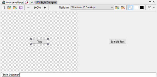
The FireMonkey Style Designer window, in combination with the Structure view and the Object Inspector, helps you create, edit, and test FireMonkey styles.
Opening the FireMonkey Style Designer
- To work with Platform styles, in the Form Designer or Structure View, double-click a style book component.
- To work with Custom styles, use the following commands of the shortcut menu displayed when you right-clicked a styled component:
- Edit Default Style:
- Opens a new FireMonkey Style Designer window in which you can modify the style for the component class. For example, if you right-clicked a button, you can modify the "buttonStyle" object (a default style for the TButton class) .
- Edit Custom Style:
- Opens a new FireMonkey Style Designer window in which you can modify the selected control style. For example, if you right-clicked a button, you can modify the "button1Style" object (a style for this button only).
- Edit Default Style:
Window
The FireMonkey Style Designer window is made of:
- An object design area on the left-hand side where you can modify objects of your style visually.
- A preview on the right-hand side that shows your style rendered with an example control.
- A toolbar on top of both.
Toolbar
The FireMonkey Style Designer toolbar contains the following buttons:
| Item | Description |
|---|---|
|
Creates a new, empty FireMonkey style.
| |
|
Opens a dialog box where you can select a FireMonkey style to load. RAD Studio provides some FireMonkey styles. You can find them in
| |
|
Opens a dialog box where you can select a FireMonkey style to add all of its style objects to your current style. | |
|
Saves the current FireMonkey style into a | |
|
Zoom controls |
You can use the - and + buttons to adjust the zoom of the object design area. Supported zoom levels are multiples of 100% between 100% and 1000%. |
|
Platform combo box |
Selects a target platform to edit. |
|
Opens a dialog box to select a platform to add to the Platform combo box. | |
|
Removes the currently selected platform from the Platform combo box. | |
|
Use a transparency grid as background for the object design area. | |
|
Use a white background for the object design area. | |
|
Use a black background for the object design area. | |
|
The arrow head of this button lists style items of the style that do not exist for the selected Platform but are available for other platforms of the current style. Click a style item on the list to add a copy to the current platform of the style. |
See Also
- Customizing FireMonkey Applications with Styles
- Applying FireMonkey Styles
- Editing a FireMonkey Style
- Working with Native and Custom FireMonkey Styles
- Using Styles Defined by Components in Design-Time Packages Installed in the IDE
- Using Styles for iOS: Multi-Resolution Styles, and the Black and Transparent Styles
- Bitmap Style Designer
- StyleLookup Support for Metropolis UI Controls (FireMonkey)
- Converting a VCL Style to a FireMonkey Style
- FMX.Styles
