Application Icon
Go Up to Application Options
Project > Options > Application > Icons
Icons identify the application on the apps list or home page or start menu, these options vary depending on the type of project you are developing. The principal options are:
- Desktop Platforms (either VCL or FireMonkey)
- iOS (FireMonkey only)
- Android (FireMonkey only)
Contents
Desktop Platforms
For a multi-device application, the Application page lets you browse directories and specify an icon file (.ico) to represent your Windows application in the taskbar.
You must use an .ico file for a Windows application; other types of graphic files are not accepted. You can use IcoFX to create an .ico file.
Single Icon
The Single Icon wizard is a comprehensive tool integrated within the Integrated Development Environment (IDE), designed to streamline the process of generating icons and splash screens for user applications across multiple platforms in multi-device applications or Windows VCL applications.
To access the wizard, open the project options of your application, go to the Application > Icons page, and use the Artwork Generator button.
| Option | Description |
|---|---|
| Foreground Layer | Select the Asset Type between Image or Text. According to your selection the options change.
By default, the Text option is selected allowing you to set the fields below
Scale defines the font size. Besides, when selecting Image you can configure the following fields:
|
| Background Layer | Select the Asset Type among Solid and Image, then configure the background layer to your preference.
By default, the Asset Type is Solid allowing you to change the Color background. When selecting Image you are able to configure the following fields.
|
| Options | Select the icon’s Shape. You can choose different shapes such as Rounded, Rectangle, Slightly Rounded, Rounded, Circle, Squircle, and Teardrop. |
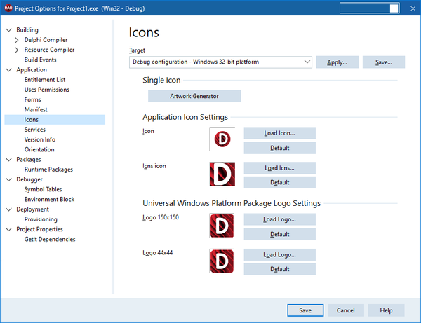
Application Icon Settings
The following options are available for Windows and macOS platforms:
| Option | Description | ||||
|---|---|---|---|---|---|
|
Icon |
Specify an icon file (
RAD Studio provides personality-specific
For console applications, setting the application icon is disabled. Windows uses a standard console-mode icon by default. If you want to change the icon for your console application, see the following tutorial: Delphi @ About.com: Change the Default Application Icon for a Console Mode Delphi Application. | ||||
|
Icns icon (for FireMonkey macOS applications) |
Specify an Icns icon (
RAD Studio provides personality-specific
Each To refresh the icns icon file that you want to deploy to the macOS, follow the steps:
|


Universal Windows Platform Package Logo Settings
The Universal Windows Platform Package Logo Settings is a feature only for Windows platforms that allows you to Load a Logo from your computer or use a Default one.
iOS
Single Icon
The Single Icon Wizard for iOS is the same as for Desktop Platforms. For more information, please go to the section above.
Application Icon Settings
For an iOS application, the Application page provides two tabs:
- iPhone
- iPad
Icons for Your iOS Apps
For the iPhone and iPad platforms, RAD Studio provides icon files that you can use for FireMonkey iOS applications in the form of .png files of various sizes, available in the /bin/Artwork/iOS
directory of your product installation.
For example, here are the names of the some of the icon files provided by RAD Studio:
- FM_ApplicationIcon_120x120.png
- FM_SpotlightSearchIcon_120x120.png
- FM_SettingIcon_58x58.png
- FM_NotificationIcon_40x40.png
- FM_LaunchImage_2x.png
To configure the images and icons that are deployed along with your iOS application, click the ellipsis ( ) in the appropriate field on the platform-specific tab (iPhone or iPad).
iPhone Tab
| Field | Description |
|---|---|
| Application icon (120x120) | Icon representing your application. This is the icon that your users can place on their Home screen, and tap to start your application. |
| Application icon (180x180) | |
| Application icon (1024x1024) | Icon representing your application on the App Store. |
| Spotlight icon (80x80) | Icon representing your application on a Spotlight search. |
| Spotlight icon (120x120) | |
| Settings icon (58x58) | Icon representing your application on the built-in Settings application. |
| Settings icon (87x87) | |
| Notification icon (40x40) | The notification icon is displayed for the notifications of your application. |
| Notification icon (60x60) | |
| Launch image Any appearance 2x scale | The launch image is displayed instead of your application until your application finishes loading and takes the place of the image. |
| Launch image Dark appearance 2x scale | |
| Launch image Any appearance 3x scale | |
| Launch image Dark appearance 3x scale | |
|
Launch image background color |
The Launch image background color option allows you to modify the background color for iOS applications for light and dark modes. |
| Launch image dark background color |
iPad Tab
| Field | Description |
|---|---|
| Application icon (152x152) | Icon representing your application. This is the icon that your users can place on their Home screen, and tap to start your application. |
| Application icon (167x167) | |
| Spotlight icon (80x80) | Icon representing your application on a Spotlight search. |
| Settings icon (58x58) | Icon representing your application on the built-in Settings application. |
| Notification icon (40x40) | The notification icon is displayed for the notifications of your application. |
| Launch image Any appearance 2x scale |
The launch image is displayed instead of your application until your application finishes loading and takes the place of the image. |
| Launch image Dark appearance 2x scale |
Preview
| Option | Description |
|---|---|
|
Preview |
For iOS target platforms, this field appears on the right-hand side of the Application page and displays a preview of the selected image. |
|
Actual size |
Check this checkbox to have the Preview show the icon in its actual size. By default, the preview is resized so that it does not take more space than is available in the right-hand column. Depending on the size of the image, you might need to scroll to see the whole image. |
Notes for iOS
- You can always configure the images and icons in the iPhone and iPad tabs, regardless of the target iOS device currently selected.
- Image files must be
.pngfiles, and the files must have the required dimensions; otherwise you get an error message.
- Not all images are required; for details, see the Apple Custom Icon and Image Creation Guidelines.
- If you do not want to provide a specific image, clear the image field, and click OK.
- If you clear an image field, make sure the selected Target on the Application page is All configurations. Empty fields are filled with the paths in parent targets, and All configurations is the only target that does not get overwritten.
- You can also define the
UIDeviceFamilyproperty value associated with your iOS app.UIDeviceFamilyis a value in the info.plist file associated with your iOS app;UIDeviceFamilydefines the iOS devices on which your app is supported. For iOS apps, the defaultUIDeviceFamilyis iPhone & iPad, but you can limit your iOS app to either iPad or iPhone if you prefer. SetUIDeviceFamilyin the Key/Value list on Project > Options > Version Info.
- iOS applications can be designed to support either Any or Dark appearance mode or both appearance modes at the same time.
| Light appearance | Dark appearance |
|---|---|
The launch screen's background color and launch screen's image for the 'Any' appearance mode are used in an iOS application when the target device:
|
The launch screen's background color and image for the Dark appearance mode are used in an iOS application when the target device:
|
- The Launch image background color and Launch image dark background color options are available only under the iPhone tab, but they are applicable to both iPhone and iPad devices.
- The support for the Dark appearance mode in an iOS application is optional. If an iOS application does not need to support the Dark appearance mode at this time, it is possible to clear the Launch image dark appearance 2x scale and Launch image dark appearance 3x scale options.
Android
Single Icon
The Single Icon Wizard for Android is almost the same as for Desktop Platforms. For more information, please go to the section above. The difference resides in the Splash Screens Wizard.
After configuring the Icon settings, you can use a similar set of options to configure the Splash Screens Light and Dark modes.

This fills all of the different icons for the platform at once, generating elements of the expected sizes.
\bin\Artwork\Android directory of your product installation.Application Icon Settings
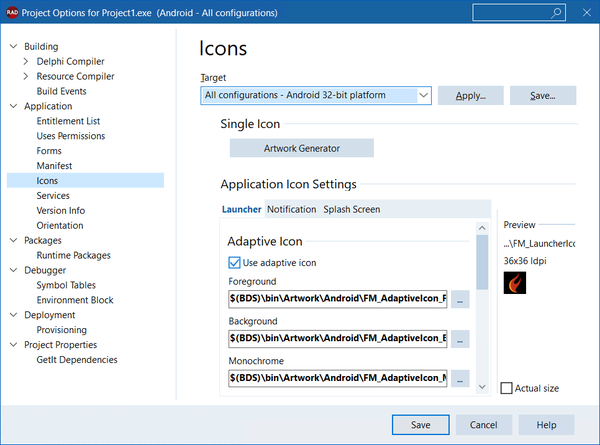
The Icons option for Android platforms allows you to configure icons for your project. To do so, RAD Studio presents several tabs where you can set up your application icons.
Launcher
The Launcher option allows you to choose between Adaptive Icon and Legacy Launcher. This icon is the one that your users can place on their Home screen and tap to start your application.
Adaptive Icon
As default, the Use adaptive icon option is selected since Google recommends using it for any modern version of Android. With this option, you can configure the following fields.
| Field | Description |
|---|---|
| Foreground | This option allows you to configure the icon’s layers, you can select them directly from your computer. |
| Background | |
| Monochrome Layer |
Legacy Launcher
To use the Legacy Launcher unselect the Use adaptive icon option. When done, you can set up the following fields:
| Field | Description |
|---|---|
| 36x36 ldpi |
Icon representing your application. |
| 48x48 mdpi | |
| 72x72 hdpi | |
| 96x96 xhdpi | |
| 144x144 xxhdpi | |
| 192x192 xxxhdpi |
Notification
In the Notification tab you can modify the icons that users use for notifications.
You can Use accent color by selecting the checkbox and choosing a color from the Notification accent color dropdown list.
Vectorized Icon
Configure the Vectorized Icon by selecting your icon from your device. This option is enabled by default.
Legacy Notification
Configure your notification icon in different sizes by choosing it from your device.
| Field | Description |
|---|---|
| 24x24 mdpi |
Notification icons for your application. |
| 36x36 hdpi | |
| 48x48 xhdpi | |
| 72x72 xxhdpi | |
| 96x96 xxxhdpi |
Splash Images
These are the images that will be displayed while your application is opening. You can specify either a single image or several different-sized images. To minimize rescaling, use either one multi-res bitmap or several different-sized images.
You can enable and disable the splash images of your project using the Include splash image checkbox. Besides, change the background and dark background color by choosing a different one from their dropdown lists .
RAD Studio allows you to use Vectorized Splash and Legacy Splash Screen. Both options are enabled by default.
Vectorized Splash
Enabled the Vectorized Splash by selecting the Use vectorized image option. If it is enabled, you can set it up by the following fields:
| Fields | Description |
|---|---|
| Foreground |
This option allows you to configure the foreground in light and dark mode. |
| Dark Foreground | |
| Android 12 foreground |
This option allows you to configure the foreground in light and dark mode. |
| Android 12 dark foreground |
Legacy Splash Screen
Enabled the Legacy Splash Screen by selecting the Include splash image option. If it is enabled, you can set it up by the following fields:
| Field | Description |
|---|---|
| 426x320 small |
Splash images for your application. |
| 470x320 normal | |
| 640x480 large | |
| 960x720 xlarge |
Splash tile mode: When the tile mode is enabled, the image is repeated. Use this combo box to set the tile mode using the following options:
| Tile mode | Description |
|---|---|
| disabled | The image appears once on the screen. |
| clamp | The color at the edge of the image is replicated to fit the screen. |
| repeat | The image is repeated horizontally and vertically to fit the screen. |
| mirror | The image is repeated horizontally and vertically to fit the screen with a mirror effect on alternate images. |
See the Android Tile Mode documentation for more information.
Splash gravity: The splash gravity indicates the position of the image on the screen when the image is smaller than the screen. Splash gravity is taken into account only when Splash tile mode is disabled. See the Android Gravity documentation for more information.
Preview
Each of the Icons wizard presents a Preview section where you can configure different options.
| Option | Description |
|---|---|
|
Preview |
For Android target platforms, this field appears on the right-hand side of the Application page and displays a preview of the selected image. |
|
Actual size |
Check this checkbox to have the Preview show the icon in its actual size. By default, the preview is resized so that it does not take more space than is available in the right-hand column. Depending on the size of the image, you might need to scroll to see the whole image. |
Notes about Images for Android
- You can always configure your app images in the Artwork tab, regardless of the target mobile device currently selected.
- Image files must be *
.png* files, and the files must have the required dimensions; otherwise you get an error message. - Android allows using 9-patch images that determine how the image is stretched.
- You can convert an image to 9-patch using draw9patch tool available in
C:\Users\Public\Documents\Embarcadero\Studio\23.0\CatalogRepository\AndroidSDK-<Version>\tools\lib. - When using the draw9patch tool, you can load
.pngand.9.pngimages, once completed your image will be saved with.9.pngextension. Draw9patch works with a one-pixel perimeter, so.pngimages will be saved with 4 extra pixels (2 horizontally and 2 vertically),.9.pngimages remain as they are. - Set the top and left one-pixel wide guides with solid black to determine the scalable area of the image. See the Android Draw 9-patch documentation for more information.
- You can convert an image to 9-patch using draw9patch tool available in
- All images are optional.
- If you do not want to provide a specific image, clear the image field, and click OK.
- If you clear an image field, make sure the selected Target on the Application page is All configurations. Empty fields are filled with the paths in parent targets, and All configurations is the only target that does not get overwritten.
- When you run an Android application on a Kindle Fire, the carousel shows the mdpi (48x48) launcher icon of your application, even if you provide an icon of higher resolution, and it looks blurry. However, this only happens when you install your Android application on your Kindle Fire through USB. When your users download your application from the Amazon application store, the icon of your application that the Kindle Fire displays on the carousel is downloaded from the Amazon application store itself, where you can upload a small application icon (114x114) and a large application icon (512x512). See the Amazon documentation for more information.
- To deploy an Android application without a splash screen, before disabling the Include splash image option and re-building the application first is necessary to manually delete the splash_image_def.xml, styles.xml and styles-v21.xml files that were created for a previous build of your application (these files are supposed to be inside the '<Active-Target-Platform>\<Active-Build-Configuration>' sub-folder).
- Adaptive Icons: According to the Android documentation, we shouldn't clip or use icon format masks, as Android itself must configure the icon according to its theme to standardize the OS icon format. Therefore the shape value is ignored for Android adaptive icons.
- Splash screen: For the Android platform we are currently ignoring the background color (outside of the image surface).
Topics
- Application Icns dialog box
- Appearance page
- Orientation page