FMX.Layouts.TGridPanelLayout
Delphi
TGridPanelLayout = class(TControl)
C++
class PASCALIMPLEMENTATION TGridPanelLayout : public Fmx::Controls::TControl
Properties
| Type | Visibility | Source | Unit | Parent |
|---|---|---|---|---|
| class | public | FMX.Layouts.pas FMX.Layouts.hpp |
FMX.Layouts | FMX.Layouts |
Description
Implements a grid panel layout control in which each component is placed within a cell on a grid panel.
In a TGridPanelLayout layout, you specify the number of rows and columns on the grid panel, then each component is placed into the next available cell in the grid panel, regardless of where you place it with the mouse. If each grid panel layout's cell already contains a control and you add more controls, the location for the new controls is determined by the ExpandStyle property. For example, using the default AddRows value of the ExpandStyle property, a new row is added to the grid panel, and each cell in this row can contain a new control.
TGridPanelLayout layouts provide the following behavior:
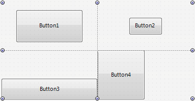
- You can explicitly set the Height, Width, Align, and Anchors properties of child controls to manually resize and align child controls placed inside cells on a TGridPanelLayout layout:
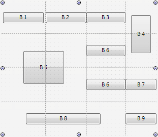
- You can specify that a child control can span on several merged cells. For example, look at the following figure:
- Here, the B4 button spans on two cells in the rightmost column, the B5 button occupies four cells in two rows and two columns and the B8 button occupies three cells in the bottom row.
To specify that a child control can span on several cells you can use the following trick:
- In the Structure view, locate the desired
TGridPanelLayoutlayout node. - Under this node, locate the respective
Control Collectionnode. - Among control items in this
Control Collection, select the control item associated with the desired child control. The Object Inspector shows the properties of this control item. - In the ColumnSpan property, type the number of cells that can be occupied be the control item in the respective column (specified in the Column property).
- In the RowSpan property, type the number of cells that can be occupied by the control item in the respective row (specified in the Row property).

