VCL Styles Support for High-DPI Graphics
The RAD Studio 10.4 VCL Styles architecture has been significantly extended to support High-DPI graphics and 4K monitors.
Previous versions of RAD Studio had a single image for all graphical elements of a style, and specific information on the sizes of specified elements.
Now all graphical elements are automatically scaled for the proper resolution of the monitor the element is displayed on. This means that the scaling depends on the DPI resolution of the target computer or the current monitor, in case of multi-monitor systems.
The style designer now allows including additional images for specific objects and different resolutions.
The names of the new elements are based on a convention name of object + DPI information, with an underscore separating the name from the size information, using the following format:
- [name]_15x (for 150% DPI)
- [name]_20x (for 200% DPI)
RAD Studio 10.4 adds elements only for 150% and 200% DPI for most of the VCL styles shipped within the product.
A VCL Style, (*.vsf file), now includes additional 1.5x and 2x graphics for elements with fixed sizes, like arrows, DB Navigator icons, etc. and those need to be scaled.
Object's tree of a style has additional elements linked to High-DPI graphics.
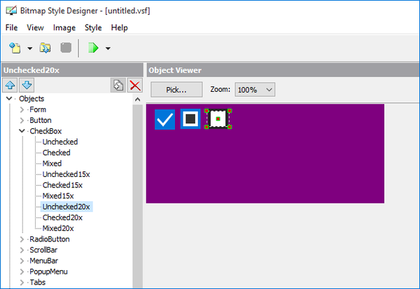
The elements of a style that supports scaling with multiple style images are:
- Form: title buttons
- CheckBox: glyph
- RadioButton: glyph
- ScrollBar: arrows
- ComboBox: button arrow
- TrackBar: elements
- ControlBar: gripper
- StatusBar: gripper
- CategoryPanels: chevron
- CategoryButtons: chevron
- DBNavigator: button icons
- DBGrid: cursor icons
- MediaPlayer: button icons
- SearchEdit: icons
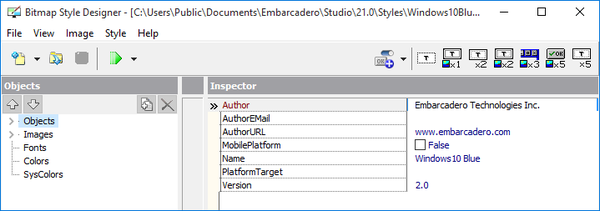
The version property of updated High-DPI Styles is 2.0, see properties of Objects root in the Bitmap Style Designer tool:
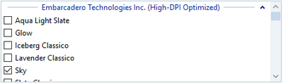
Yo can see VCL Styles with High-DPI support in the additional High-DPI Optimized section of the style list in Project Options dialog:
Contents
Style API Changes
In general terms, the style API has been fully revised to scale elements to any DPI automatically by choosing optimal DPI's element as source. For example, using Arrow_20x for 175% DPI.
Now the style API has a scaled functionality, which automatically detects elements for scaling. It can work with old styles (without High-DPI elements) and with new VCL Styles with High-DPI support. If a VCL Style does not include a High-DPI element, the the Style API scales existing elements. All methods now have a DPI parameter, whichs comes for VCL Style Hook classes.
The High-DPI support was added also to VCL Style Hook classes, with improvements in most of the code. A DPI parameter was added to all drawing methods and methods to detect system metrics. In particular, the TFormStyleHook class (applying VCL Style for TCustomForm) was extensively reworked.
New High-DPI Styles
RAD Studio 10.4 refreshed a large number of the VCL styles to provide support for the new High-DPI style mode, including:
- Aqua Light Slate
- Glow
- Iceberg Classico
- Lavender Classico
- Sky
- Slate Classico
- Tablet Dark
- Tablet Light
- Windows 10
- Windows 10 Blue
- Windows 10 Dark
- Windows 10 Green
- Windows 10 Purple
- Windows 10 SlateGray
Per Control Styling
In the past, the VCL library allowed a developer to select one style (or no style) for the entire application.
Starting with 10.4 the VCL library allows you to use multiple VCL styles at the same time in different portions of a single application, and have some elements to default to the platform theme.
Different forms in an application can use different styles, but also different visual controls that are on the same form.
The new TControl.StyleName property controls this new feature, with the name of the style for the given control; this means that if the property is empty, the parent control style is used.
As the name implies, per-control styling allows a developer to apply different styles for controls and forms in the same application. To start, you need to add multiple styles to an application, and you can use all of them. This feature works only if one of the VCL Styles is active.
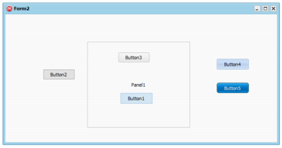
Here's an example of a form with five buttons using 5 different styles:
There are different approaches you can use to adjust the style of the different forms and controls of a VCL application:
1. Adjust style list in Project options.
2. Use the TControl.StyleName property to define the specific style for each control or each form. The StyleName value must be one of the names of the styles in the Project opctions. A control can use the StyleName defined for its parent control, so you can set the StyleName property of a form to have a specific style used by all controls on it.
By default, TControl.StyleName is empty, and control uses a default style. You can set StyleName as Windows to disable applying any style for control or form. If you set a style name that is not among the loaded VCL styles, then the control will use default style.
3. You can define a specific style also for common dialogs. Use the property TStyleManager.DialogsStyleName for that. By defaul it is empty and common dialogs use the default style of the application.
4. You can define the application style as Windows. This means that if some control or form has an empty StyleName property, then it always uses Windows style and VCL Style will be always disabled on it.
To enable this feature you have to set the TStyleManager.UseSystemStyleAsDefault property to True. Use this property if you want to enable VCL Styles for some forms only, in which you set StyleName property. But note that VCL Styles must be active in any case.
The mechanism described at point 4 above allows you to use third party components that do not support VCL styles within a styled application, something that was fairly complex to handle in the past. The new architecture allows mixing styled and unstyled controls and forms better, and leverage third party controls without giving up VCL Styles.
Styles Performance Improvements
To improve performance of VCL Styles, RAD Studio 10.4 added the ability to use a bitmap buffer of the control image, wich child controls can use to get the parent image. Controls can copy image rectangles from this buffer, instead of calling the drawing of all parent controls. A common scenario where this optimization helps is when you have multiple TGroupBox with TRadio controls on each.
To enable this feature, you can set TStyleManager.UseParentPaintBuffers to True.
You can also set the TStyleManager.UseParentPaintBuffers to TRUE when your VCL Style form flickers in the following scenarios:
- TPanel bevel and caption.
- TGraphicControl subtypes, such as TSplitter, TLabel or TImage, on TPanels.
- TListBox when you move the horizontal splitter above.
- PageControl for the horizontal scroll buttons.