Using VCL TNumberBox Control
Go Up to VCL
The VCL TNumberBox control is a modern looking numeric input control, modeled after the Windows platform WinUI NumberBox control. The control supports the input of integer numbers, floating point numbers with a given set of decimal digits and proper formatting, and currency values.
The user can increase or decrease the value using arrow buttons or allow keys or mouse wheel, and also increase and decrease by a large value using Page Up and Page Down keys.
The component supports simple expression evaluation; if enabled, a user can input an expression like 40 + 2 and the control will replace it with the result.
The control supports computing inline calculations of basic equations such as multiplication, division, addition, and subtraction (allowing the use of parentheses). Notice that you can use the symbols + and - both as binary and unary operations, so you can type -23 or + 23, you can write 55+23 and 55-23, and even combine them as in 53++23 or 53--23, which is evaluated as 53 - (-23). thus, adds the two values.
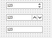
The component includes an optional spin button, configured with the SpinButtonOptions Placement property, which can be compact, inline, or disabled, as you can see below:
List of TNumberBox Component Properties
The control supports VCL styling, is HighDPI-enabled, and has many additional properties to adjust visual style and behavior. This is a list of the control properties:
|
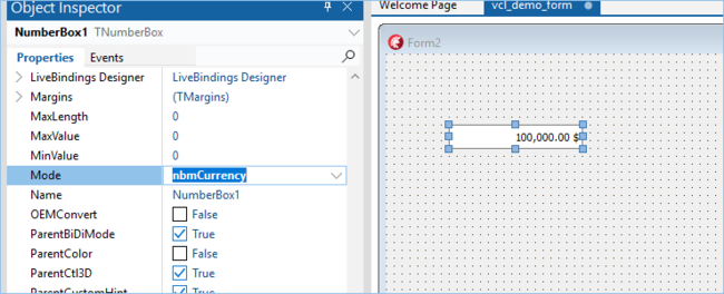
Defines in which mode control works and is based on the following enumeration: TNumberBoxMode = (nbmInteger, nbmFloat, nbmCurrency); |
|
Current Value |
|
Current Value as Integer |
|
Current Value as Extended rounded using Decimal property |
|
Current Value as Extended rounded with Decimal = 2 |
|
Defines string for currency mode, which will be added at the end of display text |
|
Defines custom text format |
|
Defines minimum value |
|
Defines maximum value |
|
Defines the number of decimal digits |
|
Defines the amount by which the Value property will change with spin button, Up/Down keys and mouse wheel |
|
Defines the amount by which the Value property will change with Page Up/Page Down keys |
|
Enables using expressions in control |
|
Defines options of spin button and is a data structure including sub-properties ButtonWidth, Placement, RepeatTimerInterval, ShowInlineDividers, and different arrow colors |
|
Uses NaN value with empty text |
|
Enables changing Value with mouse wheel using SmallStep property |
|
Enables changing Value with Up/Downand Page Up/Page Down keys |
|
Enables incrementing from the max value to the minimum one and reverse |
List of TNumberBox Component Events
The component has the following events:
|
Occurs if Value property is changed |
|
Occurs when applying custom evaluation of expression using Text and Value properties |
|
Custom validation of input char |