Brush Designer
Go Up to Property Editors Index
Use the Brush Designer at design time to specify a brush for the selected component or form. You can open the Brush Designer from the Object Inspector. For example, for a FireMonkey shape such as TRectangle, you can open the Brush Designer by double-clicking the Value column of the Fill field.
The Brush Designer displays the name of the property that you are editing, followed by a series of tabs that let you customize your brush:
- None. Select this tab to clear the brush selection.
- Solid. Specify a solid color.
- Gradient. Select this tab to clear the brush selection.
- Bitmap. Select this tab to clear the brush selection.
- Resource. Select this tab to clear the brush selection.
RAD Studio applies your changes in the Brush Designer as you perform them.
Solid Tab
The Solid tab provides a color picker with color areas that let you select a color visually. Use the vertical color bar on the center to choose a color, and click on the big area on the left-hand side to select the intensity of the selected color. The horizontal color bar below shows you the selected color.
The color picker also provides the following fields:
| Item | Description |
|---|---|
|
R |
Specify a value between 0 and 255 that is the intensity of the red color in the selected color, where 255 is the highest intensity. |
|
G |
Specify a value between 0 and 255 that is the intensity of the green color in the selected color, where 255 is the highest intensity. |
|
B |
Specify a value between 0 and 255 that is the intensity of the blue color in the selected color, where 255 is the highest intensity. |
|
A |
Specify a value between 0 and 255 that is the intensity of the alpha channel (transparency) in the selected color, where 255 is the highest intensity. 0 makes your color completely transparent. 255 makes your color completely opaque. |
|
Web color code |
Shows the web color code of the selected color, either as a name or as an hexadecimal RGBA color code. You can edit this field as well to change your color. |
Gradient Tab
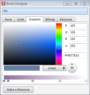
The Gradient tab provides the same color picker that you can find on the Solid tab. You can use this color picker to edit any color of your gradient.
This tab also provides the following fields to configure the actual gradient:
| Item | Description |
|---|---|
|
Gradient type |
This combo box lets you choose between the following types of gradients:
|
|
Line angle |
This control lets you select the angle of the line that defines a linear gradient. |
|
Gradient colors |
This field defines the colors in your gradient, as well as the relative distance between each one of them. The top bar shows a linear preview of the gradient, and each circle below the preview bar represents a color in the gradient. To configure your gradient:
|
Bitmap Tab
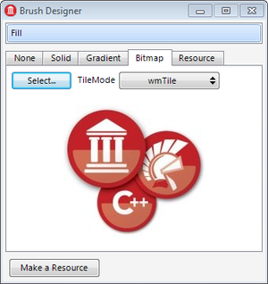
The Bitmap tab allows you to use a bitmap as brush.
This tab provides the following fields:
| Item | Description |
|---|---|
|
Select |
Click this button to load a bitmap using the Bitmap Editor. |
|
TileMode |
Use this combo box to select a WrapMode for your bitmap brush. |
Resource Tab
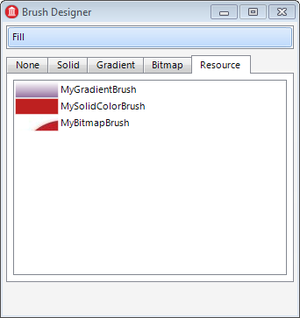
The Resource tab allows you to use an instance of TBrushObject as brush.
You can use the Brush Designer to create an instance of TBrushObject:
- Define a solid, gradient, or bitmap brush.
- Click the Make a Resource button to create an instance of TBrushObject for your brush and add it to your form.
The Resource tab shows a list of instances of TBrushObject. Select a brush from the list to use it.


