Mobile Tutorial: Using Tab Components to Display Pages (iOS and Android)
Go Up to Mobile Tutorials: Mobile Application Development (iOS and Android)
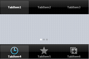
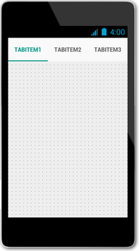
Tabs are defined by FMX.TabControl.TTabControl, which is a container that can hold several tab pages. Each tab page can contain any control as a UI element. You can hide the tab for these pages, and change pages without showing tabs.
For each tab, you can specify:
- A text label — for both iOS and Android
- Predefined icons — for iOS only
- Custom icons — for both iOS and Android
Contents
Using the Native Style for Tabs on iOS and Android
This tutorial shows tabs with the same style on both iOS and Android, but this practice is not recommended.
We recommend that you observe the native style of each platform, as follows:
- On Android:
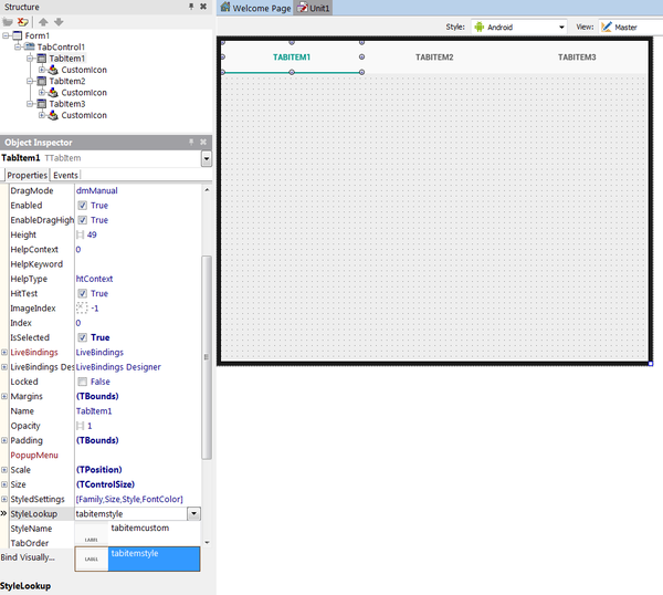
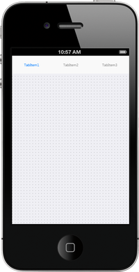
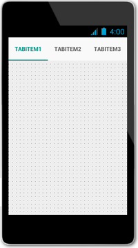
- Tabs are commonly placed at the top of the screen (so you should set TTabPosition either to Top or to PlatformDefault).
- Tabs traditionally display only text. However, FireMonkey allows you to specify custom icons to be displayed on tabs (see Using Custom Multi-Resolution Icons for Your Tabs).
- On iOS:
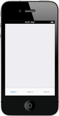
- Tabs are typically shown at the bottom of the screen (so you should set TTabPosition either to Bottom or to PlatformDefault).
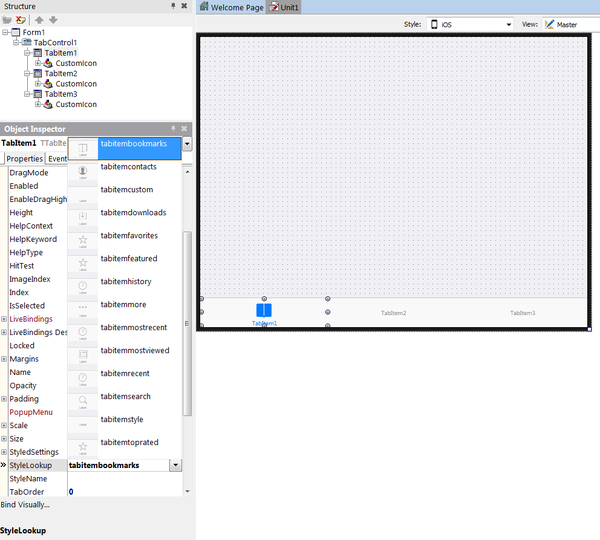
- Tab items always display both text and an icon, which can be set via the StyleLookup property for each tab.
- In iOS apps, tabs are aligned at the lower edge of the TTabControl.
- In Android apps, tabs are aligned at the top edge of the TTabControl.
Designing Tab Pages Using the Form Designer
To create tab pages in your application, use the TTabControl component with the following steps:
- Select File > New > Multi-Device Application - Delphi > Blank Application.
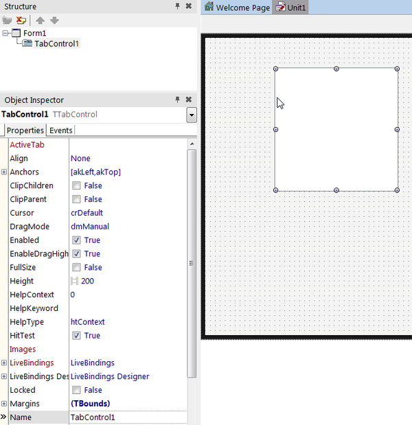
- Select TTabControl from the Tool Palette:
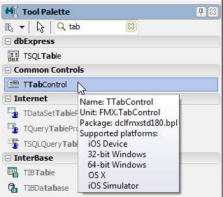
- After you drop the TTabControl, an empty TabControl is shown on the Form Designer (you might need to manually adjust the position of the TabControl):
-
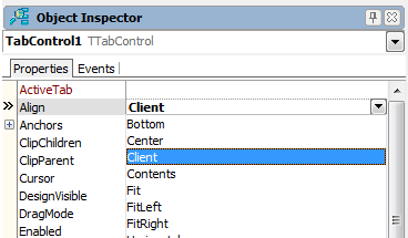
Typically, applications that use TabControl use the full screen to show pages.
To do this, you need to change the default alignment of TabControl. In the Object Inspector, change the Align property of TabControl to Client:
-
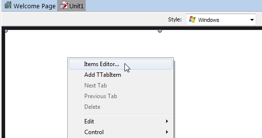
Right-click the TabControl, and select Items Editor... from the context menu:
-
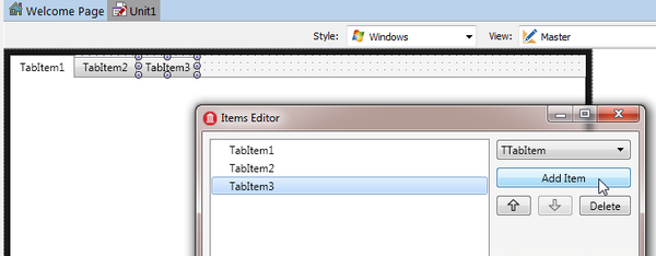
Click Add Item three times, so that now you have three instances of TabItem here. Close the dialog box.
-
On the Form Designer, select the first TabItem and change its StyleLookup property:
iOS Android
-
You can place any component on each page.
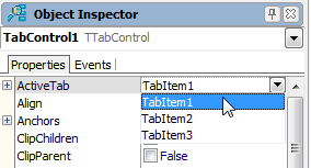
To move to a different page, just click the tab you want on the Form Designer, or change the ActiveTab property in the Object Inspector:
:
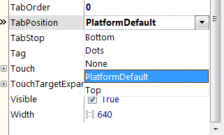
- To change the location of tabs, select the TabPosition property for the TabControl component, and set it to one of the following values in the Object Inspector:
Comparing the Tab Settings on iOS and Android
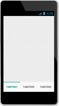
The following figures show both apps with the same TabPosition settings (Top, Bottom, Dots, and None) on iOS and Android.
However, you should set the appropriate different tab settings for each mobile platform, as indicated in #Using the Native Style for Tabs on iOS and Android.
| Top | ||||
|---|---|---|---|---|
| ||||
| Tabs are displayed at the Top. |
| Bottom | ||||
|---|---|---|---|---|
| ||||
| Tabs are displayed at the Bottom. |
| Dots | ||||
|---|---|---|---|---|
| ||||
| No Tabs are displayed.
Instead, three Dots ([...]) are displayed to indicate additional pages. |
| None | ||||
|---|---|---|---|---|
| ||||
| No Tabs or Dots are displayed at run time, although you can see them at design time. Page can be changed only through code or action. |
| Platform Default | ||||
|---|---|---|---|---|
| ||||
| Tabs are displayed with their platform default settings. |
Using Custom Multi-Resolution Icons for Your Tabs
You can use custom multi-resolution icons as well as custom text on tabs in your application.
This tutorial shows you how to construct the following three tabs that have custom icons and text:

- Notes:
- In Android apps, predefined icons are not supported, so you must use custom icons.
- In iOS apps, you can use either predefined icons or custom icons.
- To use custom icons on either iOS or Android, select the appropriate iOS or Android Style in the Form Designer, set the StyleLookup property of TTabItem to tabitemcustom, specify your custom icon as described in this section, and then build your app.
- For iOS, you can use our predefined icons by setting the StyleLookup property of TTabItem to the icon of your choice, such as
 (tabitemsearch).
Displaying Multi-Resolution Custom Icons on Tabs
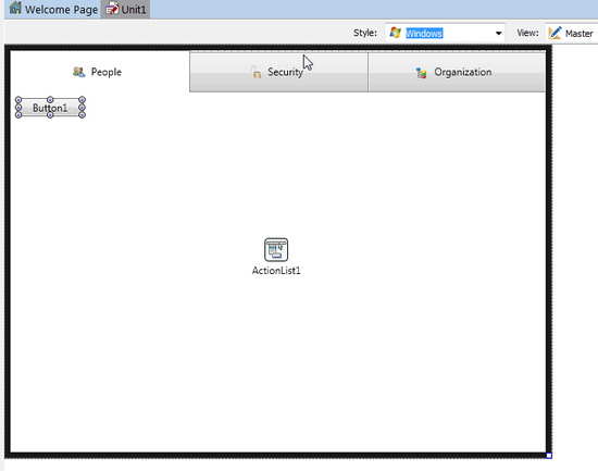
- In the Object Inspector, select TabItem1, and then change the tab caption, which is specified in the Text property to People; change the Text property of TabItem2 to Security, and TabItem3 to Organization.
- Select a tab, and click the ellipsis button [...] on the CustomIcon property of TTabItem in the Object Inspector:
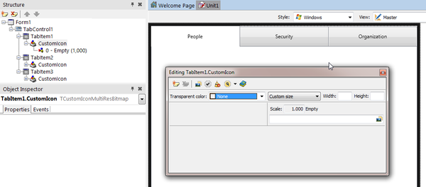
- The MultiResBitmap Editor opens:
- Ensure that you are in the Master view, and in the MultiResBitmap Editor, click the array next to Custom size, and then choose Default size.
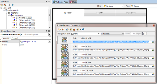
- Repeat the following steps to add any additional scales that you want to support:
- Click the Fill All from File button
 , navigate to an image file you want to use, and then click Open.
- Close the MultiResBitmap Editor.
- Repeat Steps 2 to 7 for each of the remaining tabitems, and assign each tabitem a custom icon image.
After you define a custom icon, the FireMonkey framework generates a Selected Image and Non-Selected (dimmed) Image based on the given .png file. This transformation is done using the Alpha-Channel of the bitmap data. For example:
| Original Image | Selected Image | Non-Selected Image |
Using a Single-Resolution Bitmap for a Custom Icon
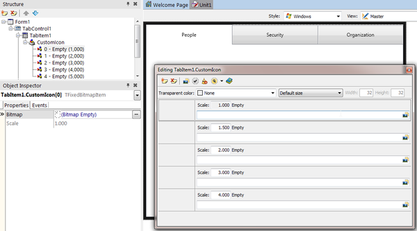
You can also use only a single-resolution bitmap by using the Bitmap Editor. A single-resolution bitmap displays only one scale in the Structure View:
To specify a single-resolution bitmap for a custom icon, perform the first step of the procedure above and then proceed as follows:
- In the Structure View, select Empty under CustomIcon:
- Now, in the Object Inspector, click the ellipsis button [...] in the Bitmap field (of the TabItem1.CustomIcon[0]). This opens the Bitmap Editor:
- In the Bitmap Editor, click the Load... button, and select a PNG file.
The recommended size is 30x30 pixels for normal resolution, and 60x60 pixels for high resolution: - Click OK to close the Bitmap Editor.
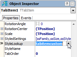
- In the Object Inspector, set the StyleLookup property to be tabitemcustom:
Defining Controls within a TabControl
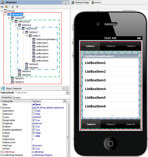
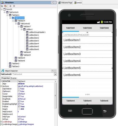
As discussed, each Tab Page can contain any number of controls including another TabControl. In such a case, you can easily browse and manage different tab pages in the Structure View:
| iOS |
|---|
| Android |
|---|
Changing the Page at Run Time
By the User Tapping the Tab
If Tabs are visible (when the TabPosition property is set to other than None), an end user can simply tap a Tab to open the associated page.
By Actions and an ActionList
An action corresponds to one or more elements of the user interface, such as menu commands, toolbar buttons, and controls. Actions serve two functions:
- Actions represent properties common to the user interface elements, such as whether a control is enabled or whether a check box is selected.
- Actions respond when a control fires, for example, when the application user clicks a button or chooses a menu item.
Here are the steps to enable a user to move to different tab pages by clicking a button:
- On the Form Designer, click TabItem1 to select it.
- From the Tool Palette, add a TActionList component to the form, and then add a TButton to TabItem1:
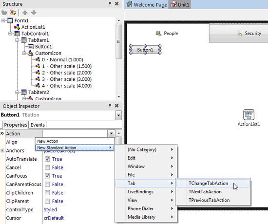
- With the button selected, in the Object Inspector, select Action | New Standard Action | Tab > TChangeTabAction from the drop-down menu. After the user clicks this button, the action you just defined is performed (the tab page changes):
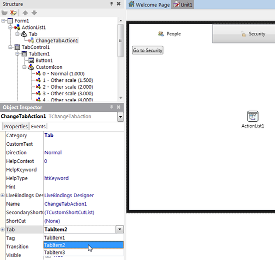
- Select ChangeTabAction1 in the Structure View, and then select TabItem2 for the Tab property in the Object Inspector. By linking to TabItem2, this action can change the page to TabItem2:
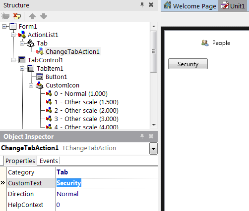
- With the previous step, the caption (the Text property) of the button is automatically changed to "Go To Security" because the caption of TabItem2 is "Security" in our example. Set the CustomText property of the ChangeTabAction1 component to Security as shown below and change the size of the button to fit the new caption text, if required.
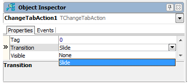
- ChangeTabAction also supports the Slide animation to indicate a transition between pages. To use it, set the Transition property to Slide:
- On the Form Designer, select TabItem2 and drop two TButtons from the Tool Palette to TabItem2.
- On the Form Designer, select Button2 and in the Object Inspector, select Action | New Standard Action | Tab > TPreviousTabAction from the drop-down menu.
- On the Form Designer, select Button3 and in the Object Inspector, select Action | New Standard Action | Tab > TNextTabAction from the drop-down menu.
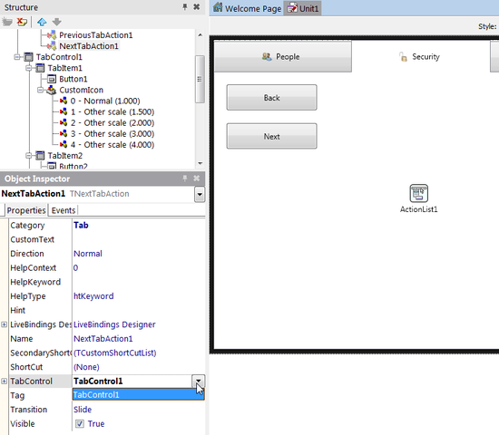
- Select PreviousTabAction1 in the Structure View and in the Object Inspector, set its TabControl property to TabControl1.
- Select NextTabAction1 in the Structure View and in the Object Inspector, set its TabControl property to TabControl1.
- On the Form Designer, select TabItem3 and drop a TButton from the Tool Palette to TabItem3.
- In the Object Inspector, set the Action property of the button to PreviousTabAction1.
By Source Code
You can use any of the following three ways to change the active tab page from your source code, by clicking the button.
Assign an Instance of TTabItem to the ActiveTab Property
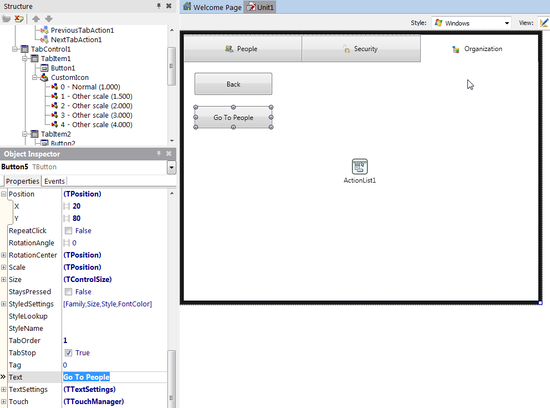
- From the Tool Palette, add a TButton to TabItem3.
- In the Object Inspector, set its Text property to Go To People.
- On the Form Designer, double-click the button to create the OnClick event handler and add the following code:
TabControl1.ActiveTab := TabItem1;
Change the TabIndex Property to a Different Value
The TabIndex property is a zero-based Integer value. You can specify any number between 0 and TabControl1.TabCount - 1.
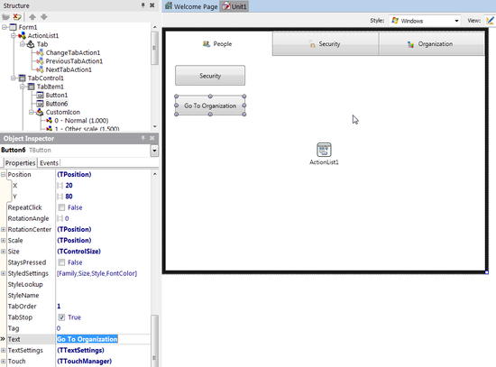
- From the Tool Palette, add a TButton to TabItem1.
- In the Object Inspector, set its Text property to Go To Organization.
- On the Form Designer, double-click the button to create the OnClick event handler and add the following code:
TabControl1.TabIndex := 2;
Call the ExecuteTarget Method of a Tab Action
You can call the ExecuteTarget method for any of the tab control actions (TChangeTabAction, TNextTabAction, and TPreviousTabAction). You must ensure to define the TChangeTabAction.Tab, TPreviousTabAction.TabControl or the TNextTabAction.TabControl properties.
  // You can set the target at run time if it is not defined yet.
  ChangeTabAction1.Tab := TabItem2;

  // Call the action
  ChangeTabAction1.ExecuteTarget(nil);
See Also
- Mobile Tutorial: Using a Button Component with Different Styles (iOS and Android)
- Mobile Tutorial: Using the Web Browser Component (iOS and Android)
- Mobile Tutorial: Using ListBox Components to Display a Table View (iOS and Android)
- Mobile Tutorial: Using LiveBindings to Populate a ListView (iOS and Android)
