FireMonkey Layouts Strategies
Go Up to Arranging FireMonkey Controls
Contents
FireMonkey layouts are containers for other graphical objects that can be used to build complex interfaces with visual appeal. The FireMonkey layouts extend the functionality of TControl to control the arrangement, sizing, and scaling of their child controls, and offer the possibility to manipulate a group of controls as a whole.
Using properties like Position, Align, Margins, and Padding with Anchors and layouts can result in complex interfaces without explicitly using complex calculations.
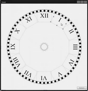
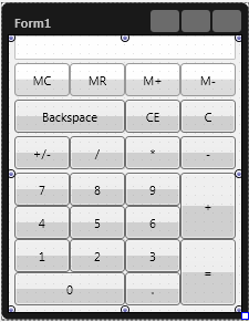
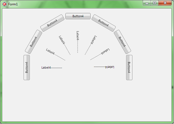
Interface examples:
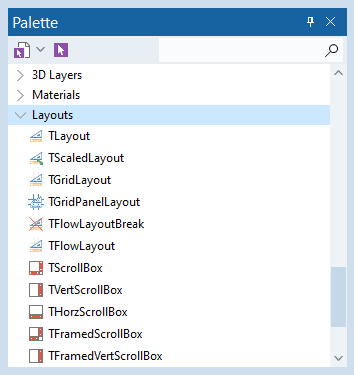
The available layouts can be found in the Tool Palette, under the Layouts category.
To use a layout, just drag and drop the layout from the Tool Palette to the form.
Kinds of Layouts
FireMonkey layouts can be split into several categories:
Simple Container
A simple container is not visible at run time and can be used to group other controls to be manipulated as a whole. For example, you can set the visibility of a group of controls at one time by setting only the Visible property of the layout. TLayout does not set automatically any of the properties of its children.
To obtain complex interfaces using TLayout, use more than one layout and the arrangement properties of the child controls of the layouts and of the layouts themselves. For example, an easy way to obtain a circular distribution of controls is to set the initial location for a TLayout with the controls inside, and then copy and paste the positioned layouts, keeping the same location and changing the RotationAngle.
Scaled Layout
A scaled layout is a container that offers the possibility to scale a group of graphical objects according to the physical dimensions of the layout. The child controls stretch along with the layout when the layout is resized. TScaledLayout keeps its original size through the OriginalWidth and OriginalHeight properties.
Scroll Layout
A scroll layout offers the possibility to scroll groups of graphical objects. You can use scroll boxes to create scrolling areas within a form. These areas are known as views. Views are common in commercial word-processor, spreadsheet, and project management applications.
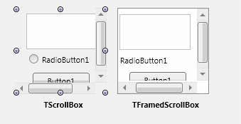
A simple TScrollBox is not framed, and at run time the child controls and scroll bar are visible, without any visible delimitation on the top and left side of the scrolled area. To delimit the scrolled area, use TFramedScrollBox.
Note: You should anchor the children of a scrolling layout only to the left or top edges. Specifically, do not anchor the children of a scrolling layout to the right or bottom edges. If the Anchors property of a scroll layout child is set to akBottom, akRight, or both, the child continues to stretch to maintain the distance to the layout edges when the layout content size is being calculated.
Smooth Inertial Scrolling
Under iOS, Mac OS, and Android, a scroll view responds to the speed and direction of gestures to reveal content in a way that feels natural to people. When users drag content in a scroll view, the content follows the touch; when users flick content, the scroll view reveals the content quickly and stops scrolling when the user touches the screen or when the end of the content is reached.
FireMonkey provides the InertialMovement unit implementing such smooth inertial moving of a scroll view under Windows. Setting inertial scrolling properties in the TAniCalculations class, you can customize the behavior of inertial moving of a scroll view in response to touch input (with the mouse or finger). Using the TAniCalculations class, you can emulate smooth inertial moving of a scroll view under Windows platforms.
In the TScrollBox and descendant classes, the AniCalculations property handles support for smooth inertial scrolling of the viewport window within the larger content. Since AniCalculations is a public property (does not have published visibility), you cannot set scrolling properties in the Object Inspector. Instead, you should programmatically set scrolling properties of AniCalculations object.
We provide the FMXTAniCalculations code example to demonstrate how to set scrolling properties programmatically.
Layouts with Predefined Arrangement
FireMonkey provides the TFlowLayout, TGridLayout, TGridPanelLayout, and TBufferedLayout layouts that automatically implement predefined arrangements of child controls in grid-like panels.
TFlowLayout
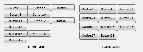
![]() TFlowLayout arranges its child controls as if they were words in a paragraph.
TFlowLayout arranges its child controls as if they were words in a paragraph.
- When using a TFlowLayout, the child controls are arranged and displayed in the layout following the order in which they were added to the layout. To start displaying child controls in a new line, add a TFlowLayoutBreak. The resulting behavior is like the one obtained adding a new line to a text paragraph. TFlowLayout follows a set of rules to arrange its children. These rules can be customized through these properties: Justify, JustifyLastLine, VerticalGap, and HorizontalGap.
- By default, the controls added to a TFlowLayout after a TFlowLayoutBreak are arranged following the rules specified by TFlowLayout. This behavior can be changed by setting ChangesRules of the TFlowLayoutBreak class to True. If ChangesRules is set to True, the child controls added after the TFlowLayoutBreak are positioned following the rules specified through the TFlowLayoutBreak properties, until all controls are displayed or another TFlowLayoutBreak is found.
TGridLayout
![]() TGridLayout arranges child controls in a grid of equally sized cells.
TGridLayout arranges child controls in a grid of equally sized cells.
- When using TGridLayout, the child controls are resized to fit the sizes specified through the ItemHeight and ItemWidth properties. The Height and Width properties for child controls are automatically set, and explicitly changing their value has no effect.
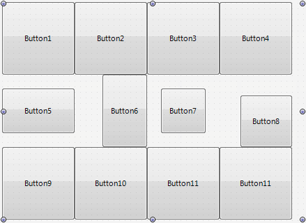
- However, you can customize sizes of buttons using the Margins properties of child controls. For example, the following image demonstrates the usage of different margins for Button5, Button6, Button7, and Button8 child controls:
- Here we set:
- Look how child controls are resized and positioned inside respective grid cells.
- When using the TGridLayout layout, the Position, Align, and Anchors properties of the child controls are automatically set. Changing these properties explicitly is ignored.
TGridPanelLayout
![]() TGridPanelLayout arranges child controls in a grid panel.
TGridPanelLayout arranges child controls in a grid panel.
- Each child control is placed within a cell on a grid panel. Unlike TGridLayout, you can manually resize and align child controls placed inside cells on TGridPanelLayout.
- That is, using the TGridPanelLayout layout, you can explicitly set the Height and Width properties of child controls. You can also explicitly set the Align and Anchors properties of child controls.
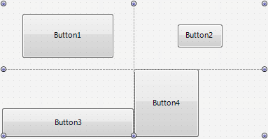
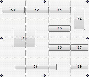
- Using the TGridPanelLayout layout, you can specify that a child control can span on several cells. For example, look at the following figure:
- Here, the B4 button spans on two cells in the rightmost column, the B5 button spans on four cells in two rows and two columns, and the B8 button spans on three cells in the bottom row.
- To specify that a child control can span on several cells you can use the following trick:
- In the Structure view, locate the desired
TGridPanelLayoutlayout node. - Under this node, locate the respective
Control Collectionnode. - Among control items in this
Control Collection, select the control item associated with the desired child control. The Object Inspector shows the properties of this control item. - In the ColumnSpan property type the number of cells that can be occupied by the control item in the respective column (specified in the Column property).
- In the RowSpan property type the number of cells that can be occupied by the control item in the respective row (specified in the Row property).
- In the Structure view, locate the desired
TBufferedLayout
![]() TBufferedLayout control stores its graphical content (including the graphical content of its internal controls) in a memory buffer, so in case there is no change, it can be repainted by displaying the buffer rather than repainting each internal control.
TBufferedLayout control stores its graphical content (including the graphical content of its internal controls) in a memory buffer, so in case there is no change, it can be repainted by displaying the buffer rather than repainting each internal control.
In many cases, the net effect is a faster refresh of the UI of the control. However, the use of TBufferedLayout on large surfaces may have a negative consequence in terms of memory usage, and that is why this behavior is not part of the core library
Layouts for 3D Applications
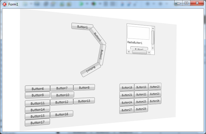
To group and arrange 2D objects in a 3D application, use FireMonkey layouts within TLayer3D or TTextLayer3D.
After adding a layer to the 3D form, arrange the 2D controls using layouts as in a 2D application.
See Also
- Customizing FireMonkey Applications with Styles
- Using Menus in a FireMonkey Application
- Arranging FireMonkey Controls
Samples
- FireMonkey Horizontal Scroll sample
