Customizing FireMonkey Applications with Styles
Go Up to FireMonkey Application Design
FireMonkey controls are arrangements of a tree composed of subcontrols, primitive shapes, and brushes, decorated with effects. These compositions are defined as styles, stored in a style book. The individual elements of a style are internally called resources; because that term has several other meanings, the term style-resource is used for clarity. Styles provide a great deal of customizations without subclassing.
The FireMonkey styles that are provided with the product are saved in .Style files located in C:\Program Files (x86)\Embarcadero\Studio\23.0\Redist\styles\Fmx. You can load these styles with FireMonkey Style Designer.
Contents
Default Styles
In FireMonkey, each control class has a default style, hard-coded per platform. A copy of the internal hard-coded style for a control class is created after you clicked the Edit Default Style command on the control's shortcut menu.
To view or edit the default style:
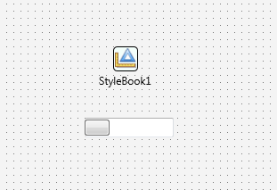
- Right-click the needed control and select Edit Default Style. After you click Edit Default Style, the empty TStyleBook is created if there was no StyleBook on the form.
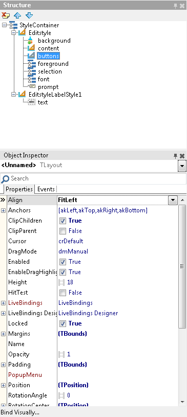
- In the Structure pane, select the component of the control that you want to change.
- Do the needed edits, save them, and close the view. Now the StyleBook that was initially created contains all your changes.
- To see your edits, double-click the StyleContainer.
For example, the default style of FMX.StdCtrls.TPanel is defined simply as:
- panelstyle: TRectangle
The name of the style-resource that defines the style is "panelstyle". It refers to a TRectangle. The appearance of this rectangle can be changed in the Style Designer, and then every TPanel on the form will have that appearance by default.
However, there is no rule that a TPanel must be represented by a TRectangle. A TRoundRect or TEllipse would work. Even simple controls can be a complex composition.
Consider FMX.StdCtrls.TCheckBox, which looks something like:
- checkboxstyle: TLayout (the entire control)
- TLayout (the layout for the box)
- background: TRectangle (the box itself, which is a composition of:)
- TGlowEffect (glows when the control has focused)
- TRectangle (the outside rectangle that forms the box)
- TRectangle (the inside rectangle)
- TColorAnimation (color animation when the mouse moves over)
- TColorAnimation (and back out)
- checkmark: TPath (the check inside the box, drawn as a path, which has:)
- TColorAnimation (its color animation when the check is toggled on or off)
- background: TRectangle (the box itself, which is a composition of:)
- text: TText (and back under the top level, the text label)
- TLayout (the layout for the box)
The style is named so that it can be found and used. In addition, certain subelements are named, so that they can be referenced. When the IsChecked property is toggled, the "checkmark" has its visibility changed (by animating the opacity of its color from solid to transparent). Setting the Text property of the TCheckBox sets the Text property of the underlying TText named "text".
Resource Naming and Referencing
Two properties with similar names form the links between a control, its style, and its subcomponents:
- The StyleName is the name by which a style or style subcomponent is known to others and can be found.
- A control's StyleLookup property is set to the name of the desired style-resource to adopt that style for the specific control. When StyleLookup is empty, the default style is used.
- Subcomponents can be found by calling FindStyleResource with the desired name.
A control has both properties because it can be styled, and it can be a style element (or part of one). Simpler components like shapes cannot be styled, and can only be a style element.
Style Resource Storage: Multi-Platform TStyleBook
Now in FireMonkey, a TStyleBook component is a collection of styles for various target platforms. Each item of the collection includes a style and a platform marker (a string). There are two different platform style markers for a custom style and a platform style.
- For Platform style, there are 4 markers for each target platform, such as Windows, macOS, Android, and iOS.
- For Custom style, the number of markers increased because a customized control should be native on each version of the target platform. Now FireMonkey supports the custom styles for the following platforms:
- Windows
- Windows 7
- Windows 8 Desktop
- Windows 10 Desktop
- OSX Yosemite
- OSX Lion
- iOS
- Android Light
The FireMonkey Style Designer allows you to edit, add or remove styles from a TStyleBook component.
A given TStyleBook component can only contain either custom styles or platform styles.
To open the FireMonkey Style Designer:
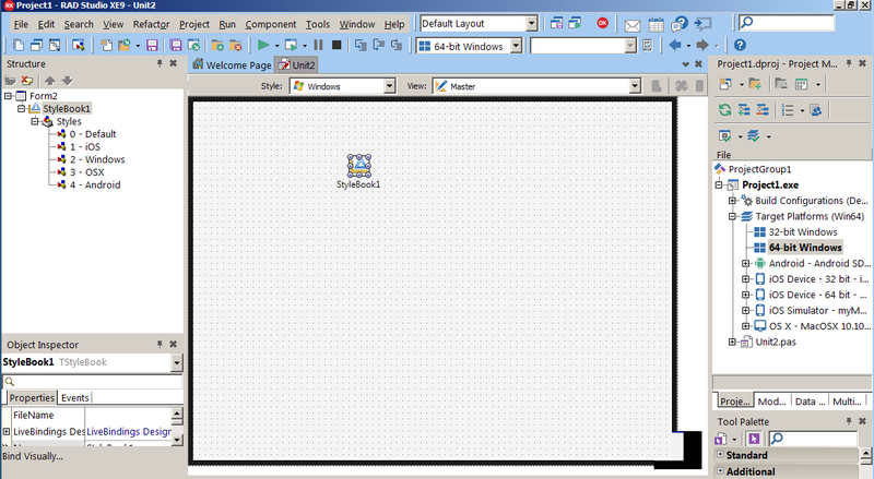
- Drop a TStyleBook on the form in the Form Designer.
- Double-click the stylebook.
For more information, see FireMonkey Style Designer.
The newly created object is set as the form's StyleBook property so that it takes effect for the form.
A form may have more than one TStyleBook object, then the StyleBook property of the form may reference any of these stylebooks, one at a time. Notice that controls in the form can always access any custom style defined in any TStyleBook object used in the current project group.
The FireMonkey Style Designer edits the styles for a single TStyleBook at a time. Double-clicking a TStyleBook on a form opens the Style Designer with those styles. The Style Designer can save the TStyleBook in a text format to a .style file, and can load such a file. The entire set of hard-coded default styles can also be loaded into the Style Designer.
Platform Styles
In FireMonkey, the term platform style refers to a .Style file that contains a set of resources for a platform. To start working with Platform styles, in the Form Designer, double-click the TStyleBook component to open the FireMonkey Style Designer.
In the FireMonkey Style Designer window, you can open an existing .Style file or save current styles to a .Style file, using the ![]() and
and ![]() buttons, respectively.
buttons, respectively.
Custom Styles
New styles can be created by modifying default styles, or starting from scratch with a single component.
- To modify a default style, right-click a control on the Form Designer and select Edit Custom Style. The generated style name is derived from the control's name, so you can save a step by choosing a good name for the control first. The generated name is assigned as the control's StyleLookup property, so that it takes effect for that control. The new style is a copy of the control's current style.
- To add a custom style for new platform, in the FireMonkey Style Designer, click the
 button and follow the provided on-screen instructions. For more information, see FireMonkey Style Designer.
 - To create a completely new style, modify a
.stylefile and load it with the FireMonkey Style Designer. For example, after saving the current set of styles, edit the file to add before the finalend:
object TBrushObject
  StyleName = 'somebrush'
end
Nested Styles
Styles may refer to other styled components. As always, styles are found by their top-level names in the TStyleBook. For example, to use the same gradient:
- In the FireMonkey Style Designer, save the existing styles in a
.stylefile. - Edit the file with a text editor to create a TBrushObject. Use an appropriate StyleName.
- Load the
.stylefile. - Select the newly defined style so that it appears in the Object Inspector.
- Open the Brush property:
- Edit the Gradient property with the Brush Designer (choose Edit from the property value's drop-down menu).
- Set the Kind property to
Gradient.
- For each component using the gradient, for example, with a TRectangle's Fill property:
- Set the Kind property to
Resource. - Open the Resource property (a TBrushResource) and set the StyleLookup to the name of the gradient in Step 2.
- Set the Kind property to
Style-Resource Search Sequence
To find a control style, RAD Studio goes through the following set of steps, stopping at the first match:
- If the form's StyleBook property is set, the Style Book is searched using two names:
- The control's StyleLookup property, if set.
- A default name constructed from the control's class name in the following way: the default name is composed of the class name without the leading "T", followed by the string "style". For example, if the class name is TEdit, the style name is Editstyle.
- The hard-coded default styles are searched using three names:
- The control's StyleLookup property, if set.
- The default style name constructed from the control's class name.
- A default name constructed from the control's parent class name, using the same steps.
Example: The default names for TPanel are "Panelstyle" and "Controlstyle". For TCalloutPanel, the default names are "CalloutPanelstyle" and "Panelstyle".
Name matching is not case-sensitive. If no match is found, the control has no content and is effectively invisible. The code that depends on finding subcomponents will fail. (That should only happen for incomplete or improperly bundled custom controls, since all built-in controls have corresponding hard-coded styles. Direct descendants of built-in classes would have their base class content; second-generation descendants would be empty.)
Form Style
Although TForm is not a control or subclass of TStyledControl, TForm is styled. Its StyleLookup property defaults to "backgroundstyle". The default style-resource with that StyleName is a grey TRectangle.
When loaded, the Align property of the resource is set to Contents to fill the form as the background. It is the first object painted, before the form's other children.
Application.Initialize, then the style is applied to all forms.
See Also
- FireMonkey Style Designer
- Bitmap Style Designer (both VCL and FMX)
- Applying FireMonkey Styles
- Editing a FireMonkey Style
- Working with Native and Custom FireMonkey Styles
- Using Styles Defined by Components in Design-Time Packages Installed in the IDE
- Using Styles for iOS: Multi-Resolution Styles, and the Black and Transparent Styles
- FireMonkey Primitive Controls and Styled Controls
- Creating a Styled FireMonkey Component by Extending an Existing Component
- Arranging FireMonkey Controls
- Using Menus in a FireMonkey Application


