FireMonkey Native Android Controls
Go Up to FireMonkey Native Controls
This topic describes the native Android controls of FireMonkey.
Contents
- 1 FireMonkey Native Android Control Presentation
- 2 Available FireMonkey Native Android Controls
- 3 Visual Changes to Native Android Controls
- 4 Adding Native Android Controls to Your Application
- 5 Combining Native Android Controls With Non-Native Controls
- 6 Advantages of the Native Android Controls
- 7 Limitations of Native Android Controls
- 8 See Also
FireMonkey Native Android Control Presentation
FireMonkey provides native presentation for certain visual components.
- Set the ControlType property to
Styledin order to have the standard FireMonkey presentation of the control.Styledis the default value of ControlType. - Set the ControlType property to
Platformto have the native styling of that control.
Available FireMonkey Native Android Controls
The following list contains all the controls that support native presentation:
Visual Changes to Native Android Controls
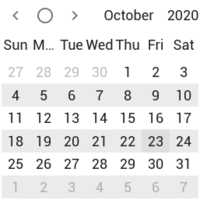
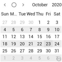
When the ControlType property of a visual component is set to Platform, the presentation of this control in the Form Designer changes to indicate that it is a native control and an small phone-like icon appears in the bottom right corner.
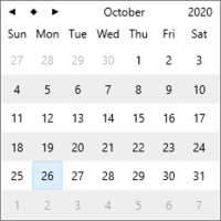
The following images demonstrate the look of native Android controls with the ControlType property set to Styled and Platform, at design time and at run time:
| Control | Design time | Run time | ||
|---|---|---|---|---|
Styled
|
Platform
|
Styled
|
Platform
| |
Adding Native Android Controls to Your Application
Follow the steps below to add native Android controls to your application:
- Add a component that supports native presentation on the form.
- In the Object Inspector Properties, set the ControlType property to Platform. The presentation of the component at design-time changes.
- Run your application on an Android device.
Alternatively, you may change the value of ControlType at run-time. To select the native presentation for a TEdit control, add the following code to your application:
Delphi:
Edit1.ControlType := TPresentedControl.TControlType.Platform;
C++:
Edit1->ControlType = TPresentedControl::TControlType::Platform;
Combining Native Android Controls With Non-Native Controls
Some non-native controls support the Z-order of native controls; therefore, you can combine them with native controls. The following list contains all the controls that have the ControlType property and therefore can be combined with native controls:
- TMultiView
- TButton
- TSpeedButton
- TColorButton
- TCornerButton
- TPopupBox
- TMagnifierGlass
- TPanel
- TLabel
- TCheckBox
- TRadioButton
- TGroupBox
- TStatusBar
- TToolBar
- TProgressBar
- TTrackBar
The following list contains the controls that are not rendered by FireMonkey via styling, and are only available as native controls (this is not new). These native-only controls don’t have the ControlType property, but they can indeed be combined with other native controls, obtaining a proper Z-order behavior:
Advantages of the Native Android Controls
Some controls support additional functionality when you use them as native controls by changing the Control’s ControlType property to Platform.
TEdit
- Auto-Correction: Words are suggested while typing, these can be used by clicking on the space bar.
- Define: You can select a word and click on Define to see the definition of such word in the dictionary.
- "." Shortcut: Double tapping the space bar inserts a period followed by a space.
- Shortcut: That will expand into the word or phrase as you type.
Some of the features above are provided in the context menu of the control, therefore the context menu of the memo control or the edit control is different for Styled and Platform.
Limitations of Native Android Controls
Before using the native controls, consider the following limitations:
- Native controls do not support predefined or custom styles. When the ControlType property of a native control is set to Platform, the value of the StyleLookup property is ignored.
- Native controls do not support the Z-order of the form: a native control is always on top of other FireMonkey controls available on your form.
The following event handlers are not supported and cannot be implemented:
- OnApplyStyleLookup
- OnClick
- OnDblClick
- OnDragDrop
- OnDragEnd
- OnDragEnter
- OnDragLeave
- OnDragOver
- OnKeyDown
- OnKeyUp
- OnPaint
- OnPainting
There are also some limitations specific to individual controls:
TCalendar
The native presentation of a calendar view does not display full months, so it does not support the following properties:
- WeekNumbers (How the property works depends on the Android theme used. Material design theme does not support this appearance property.)
- FirstDayOfWeek
See Also
- FireMonkey Native Controls
- FireMonkey Native iOS Controls
- FireMonkey Native Windows Controls
- TPresentedControl.ControlType
- Customizing FireMonkey ListView Appearance
Samples
- FireMonkey Native Controls sample
