Form Designer
Go Up to Getting Started with RAD Studio
The Form Designer (or Designer) is displayed automatically when you are creating or editing a form, such as a VCL Forms Application or an HD Multi-Device Application.
The Form Designer runs automatically when you create a graphical application that uses a form file, either a .dfm or an .fmx file.
The Form Designer (or Designer) is displayed automatically when you are creating or editing a form, such as an HD Multi-Device Application.
The Form Designer runs automatically when you create a graphical application that uses a form file (an .fmx file).
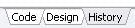
To shift focus to the Form Designer when you have a visual project open in the IDE, click the Design tab at the bottom of the main editing window:
The appearance and functionality of the Designer can change, depending on the type of form you are creating or editing. For example, if you are using an HTML Element, you can display the HTML Tag Editor in the Designer by selecting View > Tag Editor.
Form Designer Window
FireMonkey and VCL have different Form Designers and different forms:
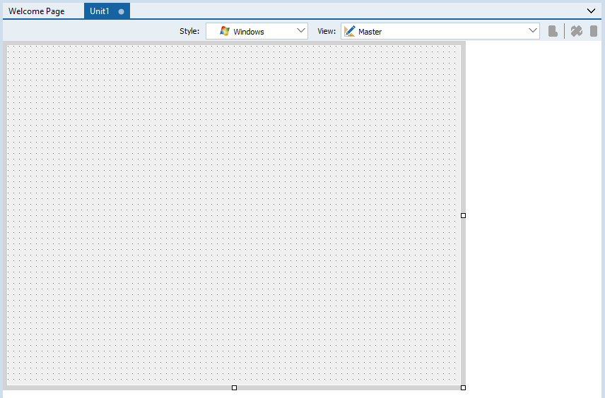
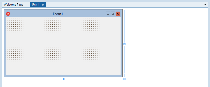
Here are the Multi-Device Form (FireMonkey) and the VCL Form as they appear (separately) in the Form Designer, when you create either a Multi-Device Application or a VCL Forms Application:
|
Multi-Device Form |
|
|
VCL Form |
|
The two forms look different, because a VCL form is a native Windows form, while a multi-device form is platform-neutral and is custom drawn by the FireMonkey tools. For example, a VCL form displays the standard Windows buttons for Minimize, Resize, and Close commands. A multi-device form appears by default with the Master view, which is platform-neutral. A multi-device application can target all the available platforms while VCL only targets Windows.
Despite these visual differences, the Form Designer works almost the same for FireMonkey and VCL. One difference is that several different context menu commands are supported for FireMonkey and VCL.
Here is a Multi-Device Form as it appears in the Form Designer, when you create a Multi-Device Application:
|
Multi-Device Form |
|
Style Selector
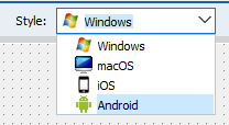
The multi-device Form Designer includes a Style Selector that chooses the basic design-time platform style used in the Master view. The styles are based on the platforms that a multi-device application can target:
- Windows
- macOS
- iOS
- Android
Select the style of the Master view at design time to show all properties related to the selected style/platform. For example, if you want to define the StyleLookup property of a TButton for an Android device, select the Android style; notice that the options available in the drop-down menu of the Object Inspector for the StyleLookup property contains selections for an Android device.
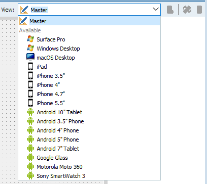
View Selector
The multi-device Form Designer includes a View Selector, a drop-down menu that shows all the Available views that represent different devices, such as specific iOS, Android, Windows and OS X devices. After you select views from the Available list for your project, the views are added to the Created list. See Using FireMonkey Views.
The View Selector provides the following controls:
| Icon | Description |
|---|---|
|
|
Selects the current view from a drop-down list of views. You can add one or more views to your project just by clicking views from the Available list. See Adding Views to Your Multi-Device Project. You can also create customized views and add them to the View Selector. See Adding a Customized View to the View Selector. |
|
|
Removes the current view. A Confirm dialog appears. The view is removed from the code. |
|
|
Rotates the current view 90 degrees clockwise. Available only for mobile views (not available for desktop views). |
|
|
Hides the frame of a selected view (or shows the frame if it was previously hidden). |
Visual Components
You can add visual components to your multi-device or VCL form by dragging selected components creating from the Tool Palette, located in the lower-right section of the IDE, onto the form. These are the components that will be visible to the end user at run time. The objects available on the Tool Palette change dynamically, depending on the type of application or form you are designing.
The Tool Palette includes controls such as buttons, labels, toolbars, and list boxes for each of the various tool categories; types of applications if you are working at the project level, such as DLL wizards, console or logo applications; and web controls, HTML elements, and data components if you are working on a web application.
For visual and nonvisual components in the Form Designer, you can view and set properties and events by using the Object Inspector.
Nonvisual Components
Nonvisual components such as a GestureManager are attached to the form, but they are only visible at design time; they are not visible to end users at run time. You can use nonvisual components as a way to reuse groups of database and system objects, or isolate the parts of your application that handle database connectivity and business rules.
The IDE allows you to hide or show non-visual components at design time.
Context Menu
When you right-click a form in the Form Designer, the context menu is displayed. The context menu commands are available for both VCL and FireMonkey, unless otherwise noted in the following table.
| Item | Description |
|---|---|
|
Items Editor (certain FireMonkey components) |
Opens the Items Designer with focus on the selected control. |
|
Add Item (certain FireMonkey components) |
Allows you to add an item to the selected control on the form. For example, if you add a TEdit control to a multi-device form, you can right-click the TEdit control, select Add Item, and add an embedded glyph such as TPasswordEditButton. |
|
Edit |
Select from the following editing subcommands, which apply to the Form Designer contents:
|
|
Control |
Controls the front/back layers of the selected control. Choose from the following subcommands: |
|
(only if enabled in Tools > Options > LiveBindings) |
Opens the LiveBindings Wizard. |
|
Opens the LiveBindings Designer. | |
|
Position |
Sets the alignment, size, and scale of the selected control. Choose from the following subcommands:
|
|
Reverses right and left. Choose from the following subcommands:
| |
|
Tab Order |
Invokes the Edit Tab Order dialog box. |
|
Creation Order (nonvisual components) |
Opens the Creation Order dialog box. |
|
Allows you to hide or show non-visual components at design-time. | |
|
Resets the properties, methods, and events of the selected control to the values of the base class control. See Revert to Inherited. | |
|
Add to Repository |
Opens the Add to Repository dialog box. |
|
Opens the current form file as text in the Code Editor window. See View as Text. | |
|
Saves the form file either in text form (enabled) or in binary form (disabled). See Text DFM or Text FMX. | |
|
Edit Default Style (FireMonkey desktop controls) |
Opens the FireMonkey Style Designer. For more information, see Customizing FireMonkey Applications with Styles. |
|
Test Dialog (VCL only) |
For any of the modal VCL dialog boxes, tests the dialog. That is, if you right-click an OpenDialog on the Form Designer and select Test Dialog, the standard File Open dialog is displayed. |
Shortcut Keys on the Form Designer
The following shortcut keys can be used to move and resize the components on the Form Designer.
| Shortcut | Action |
|---|---|
|
|
Selects all the child controls from the parent control that are located inside the area selected with the mouse. |
|
|
Selects several controls simultaneously. Hold down Shift key while you click the different controls to select. |
|
|
Moves the selected component slowly |
|
|
Moves the component faster |
|
|
Changes focus among components |
|
|
Changes the size of the component |
|
|
Selects the parent component |
|
|
Moves forward to the next Editing tab |
|
|
Moves backward to the previous Editing tab |
New Guidelines and Features
The FireMonkey Style Designer in Olympus introduces guidelines and other features found in the VCL designer, with a different implementation. Some of these new features are:
1. Components hints are displayed while moving or resizing them.

2. Controls offer guidelines for alignment on the sides (there is no plan to have a base text alignment, due to the complexity of text positioning for styled controls):

3. Controls display standard margins distance with a line across and distance indication when this matches margin or padding distance:

4. The form and component resize controls (grab handles when a control is selected, and the form or frame design edge to resize) have been changed to use the same look and feel as the VCL form designer.
See Also
- Form Designer Options.
- High DPI
- Mobile Tutorial: Using a Button Component with Different Styles (iOS and Android)