Mobile Tutorial: Using a Button Component with Different Styles (iOS and Android)
Go Up to Mobile Tutorials: Mobile Application Development (iOS and Android)
Contents
Buttons in Mobile Platforms
FireMonkey defines various types of buttons, and you can use these different types of buttons with the same steps described here. The FireMonkey buttons include TButton and TSpeedButton.
Following are some examples of different styles with Button components available for you to use in different parts of the user interface of your application:
- Buttons on the Form:
| iOS | Android |
|---|---|
|
|
|
|
|
|
- Buttons on the Navigation Bar (also known as Toolbar):
| iOS | Android |
|---|---|
|
|
|
|
|
|
|
|
|
|
|
|
|
|
|
|
|
|
Define the Look and Feel for a Button Component
After you place a new button on the Form Designer, you can specify some important properties for a selected component by using the Object Inspector.
Select a component (in this case, a button), and then browse and change the value of some properties as follows:
- Change the text displayed on the button surface by updating the value of the Text property in the Object Inspector.
- Change the value of the Position.X and Position.Y properties (or drag the component using your mouse.)
- Change the value of the Height and/or Width properties (or drag the edge of the component using your mouse.)
- Click the down-arrow in the StyleLookup property.
- In the StyleLookup drop-down list, you can select a predefined Style based on how your component is to be used:
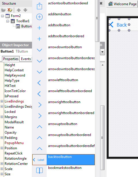
- In the StyleLookup drop-down list, you can select a predefined Style based on how your component is to be used:
- To create a colored button, change the values of the TintColor and IconTintColor properties. The latter property is available only for styled buttons with icons. The next section gives more details about using TintColor and IconTintColor.

Using TintColor and IconTintColor on Buttons
For TButton and TSpeedButton, FireMonkey provides two properties that determine how to tint or color the button:
- TintColor specifies the button background color.
- IconTintColor specifies the color of the icon on styled buttons.
Note: The TintColor and IconTintColor properties are only available in the Object Inspector if you select a proper Style for the button and select a proper View in the Form Designer (these properties are not visible in all Views).
For the Android target platform:
You can apply a tint to most buttons of any style:
- For speed buttons, you need to select a proper StyleLookup value in order to change the TintColor value in the Object Inspector.
- To modify TintColor and IconTintColor, choose an Android device from the Views list in the upper right of the Form Designer.

For the iOS target platforms:
- FireMonkey provides buttons that correspond to the Apple Style Guide, and some buttons might not support the tint feature.
- For example, on iOS, segmented buttons have the TintColor property.
When you change the StyleLookup property of a button, the Object Inspector automatically displays or hides the TintColor and IconTintColor properties as appropriate for the StyleLookup property value. The following image shows three TSpeedButtons on an Android app:

Using Styled and Colored Buttons on Target Platforms
For information on the availability of the StyleLookup, TintColor, and IconTintColor properties for buttons on all target platforms, see this summary table: Using Styled and Colored Buttons on Target Platforms.
Customizing Buttons with Styles
Now in FireMonkey, a TStyleBook component is a collection of styles for various target platforms. You can create your custom styles for individual buttons or for a whole control class (TButton or TSpeedButton).
To start working with custom styles for buttons
- In the Form Designer, ensure that you have selected Master from the View selector.
- On the Form Designer, right-click a button or speed button, then choose on the shortcut menu one of the following items:
- Edit Custom Style: opens the FireMonkey Style Designer to edit the styles for selected button.
- Edit Default Style: opens the FireMonkey Style Designer to edit the styles for the selected control class (such as TButton or TSpeedButton).

For more information about working with custom styles, see the following topics:
Placing an Image over a Button
RAD Studio allows you to easily put custom images on button components at design time.
To place an image over a button:
- With a TButton and TImage component on the Form Designer, make TImage a child component of TButton. (Use the Structure View.)
- In the Object Inspector, select TImage and set its Align property to
Client. - In the Structure View, select the button, expand the Image node, and then click 0 - Empty (1.000).
- In the Object Inspector, click the ellipsis button (...) next to Bitmap.
- Add your custom image in the MultiResBitmap Editor.
- In the Object Inspector, select TButton, and do the following:

Create a Segmented Control Using Button Components
FireMonkey uses a SpeedButton component to define the Segmented Control, which gives users the ability to select one value from several options.
| iOS | Android |
|---|---|
|
|
|

To define a Segmented Control, use the following steps:
- Place three TSpeedButton components from the Tool Palette. Place the TSpeedButton components next to each other using your mouse:
| iOS | Android |
|---|---|
|
|
|


- Select the first component, and change its StyleLookup property to segmentedbuttonleft:
| iOS | Android |
|---|---|
|
|
|


- Select the second component, and change its StyleLookup property to segmentedbuttonmiddle.
- Select the third component, and change its StyleLookup property to segmentedbuttonright. Now all three buttons look like a Segmented Control:
| iOS | Android |
|---|---|
|
|
|


- Select each component, and change the Text property as you like:
| iOS | Android |
|---|---|
|
|
|


- Use the mouse to select these three buttons:
| iOS | Android |
|---|---|
|
|
|


- Set the GroupName property to a unique name such as LocationSegments:

- To specify that one of these components is to appear as Pressed by default, set the IsPressed property for one component to True:
| iOS | Android |
|---|---|
|
|
|
Create a Scope Bar on a Toolbar Component
You can define a Segmented Control on a toolbar; this is also known as a Scope Bar, a segmented control that can be used to control the scope of a search.
Use the same TSpeedButton controls as in the previous steps, but with the following values for the StyleLookup property (only available on iOS target platform):
- toolbuttonleft
- toolbuttonmiddle
- toolbuttonright
(on the Android target platform set StyleLookup as toolbutton for each of the buttons.)
| iOS | Android |
|---|---|
|
|
|
Important Differences Between a TButton and TSpeedButton
- TSpeedButton cannot receive
TABfocus. That also means that pressing a TSpeedButton does not take away focus from other elements. - TSpeedButton is primarily meant to be a toolbar button.
- The style of TSpeedButton can be different than the style of TButton. For example, on the Android platform, the default style of the TSpeedButton is similar to the toolbutton style of the TButton. If you want a TSpeedButton with a similar style to the TButton, choose the buttonstyle style.
See Also
- Mobile Tutorial: Creating an Application for Mobile Platforms (iOS and Android)
- Mobile Tutorial: Using a Calendar Component to Pick a Date (iOS and Android)
- Tutorial: Using the BitmapLinks Editor
- FireMonkey Style Designer
- Android Mobile Application Development
- FMX.Controls Sample
- FMX.StdCtrls.TButton
- FMX.StdCtrls.TSpeedButton
- FMX.Controls.TStyledControl.StyleLookup
- FMX.StdCtrls.TToolBar
- FMX.StdCtrls.TCustomButton.IconTintColor
- FMX.StdCtrls.TCustomButton.TintColor
- FMX.StdCtrls.TToolBar.TintColor